Faster Web Made Easy: New Technologies and Tools for Developers

Recently, at the Pilsen meetup of our Frontendisti.cz community, I gave a talk with ten tips on the latest web speed innovations, tailored specifically for developers.
Let's explore these fresh, hot-off-the-press technologies and tools in written form. Developers can use the following text as a guide for what to learn over the summer so they can start crafting faster websites by September.
I won't ramble on, so let's dive straight into the tips.
1) WebP, AVIF, the Underutilized Image Savers
To simplify, traditional image formats have their primary purposes:
- GIF is for animations
- JPEG supports lossy compression
- PNG handles partial transparency
- SVG is the only format that manages vectors
New image formats WebP and AVIF support both lossy and lossless compression, animations, and partial transparency. Both, however, with significantly smaller data sizes.
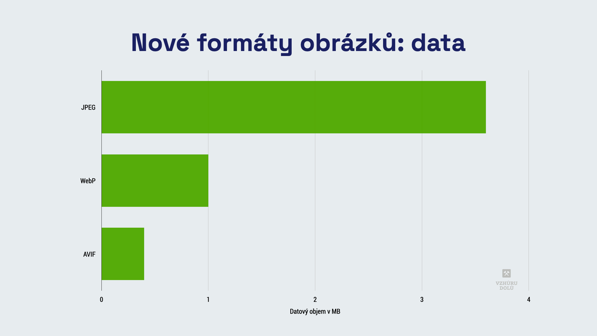
You'll still need SVG for vectors, but all other older formats are overshadowed by these newcomers.
Not using WebP or AVIF yet? You should be:
- WebP already enjoys full support across all modern browsers.
- For AVIF, we're waiting on Microsoft and its Edge browser. Thanks to the picture tag, the wait isn't too burdensome.
Always serve images on the web in WebP and consider AVIF if possible.
2) Priority Hints, Speed Up LCP Instantly
Priority Hints are the spice for optimizing the LCP (Largest Contentful Paint) metric.
Preload can sometimes be handy for prioritizing the loading of specific elements, like fonts:
<link rel="preload" href="font-1.woff2" as="font" type="font/woff2" crossorigin />
The new fetchpriority attribute allows you to define higher loading priority on an HTML element, or lower it.
Consider two images in a carousel. I'll increase the priority for the first and decrease it for the second. The first will load and display much faster, improving my LCP metric:
<img fetchpriority="high" href="image-1.webp" /> <img fetchpriority="low" href="image-2.webp" />
An intriguing option is reducing file download priority via fetch in JS:
<script>
  fetch('https://example.com/', { priority: 'low' }).then((data) => {
    // Execute fetch with higher priority
  });
</script>
In the lecture recording (see above), I mentioned increasing fetch priority, but that's nonsense. When adding priority to fetch, you can only lower it. Higher priority is its default state.
Preload is supported by all browsers, while fetchpriority is currently only available in Chromium-based ones, but Safari is catching up.
Lack of support in Firefox (and currently in Safari) isn't a big issue. Consider it from a progressive enhancement perspective—some users gain the benefit of faster loading, but the lack of support doesn’t break anything for others.
Just be cautious, as with any spice. Use priority changes only when you truly know what you're doing and can measure the impacts directly in the browser.
3) aspect-ratio, Everything Asynchronous Needs an Aspect Ratio
This image is nice, but it's sad:
<img src="image.webp" alt="Image" />
Do you know why? The browser will likely have to repaint the content below it after it’s rendered. This is better:
<img src="image.webp" width="500" height="500" alt="Image" />
Always define width and height attributes for images. They reserve space so that a layout shift doesn't worsen the CLS (Cumulative Layout Shift) metric.
Don't have an image but a JavaScript component instead? Use aspect-ratio:
<p style="aspect-ratio: 4/3"></p>
The CSS property aspect-ratio sets the aspect ratio for elements that aren't images. It eliminates the need for using the "padding trick".
Support is complete across all modern browsers, see width/height and aspect-ratio. Use this for all asynchronous elements, including ads.
4) size-adjust, Prevent Layout Jumps Caused by Fonts
You can see the problem in the following image from our client Sazka.cz's optimization:

A common issue in layout shifts, measured by the CLS metric, is the different size of system fonts compared to custom fonts.
The size-adjust descriptor addresses this:
@font-face {
  font-family: 'Montserrat-fallback';
  size-adjust: 113.56999999999995%;
  src: local('Arial Bold'), local('Arial');
}
This adjustment matches the system font size to the custom font, minimizing layout shifts and thus preventing CLS deterioration due to custom fonts.
Supported by all browsers except Safari. But again, it doesn't matter.
5) BFcache, How Chrome Finally Woke Up
BFcache stands for "back & forward cache." It's a browser cache that stores pages browsed in the browser history. It's not new, but you might be surprised that Chrome only recently mastered this feature.
The speed boost from back/forward cache is noticeable at first glance:
Properly implementing BFcache (without breaking measurement or anything else) is quite complex. Read more about it at the link above.
The important thing is that as developers, among other things, you shouldn't use the following features:
- Unload, beforeunload events.
- Cache-Control: no-store headers.
- References to window.opener.
Testing BFcache support on your websites is possible in Chrome DevTools. Either in the Application tab or via Lighthouse.
BFcache support is now full after Chrome got on board. There are case studies suggesting it can really help. So far, we haven't seen a drastic speed improvement for clients, but we consider BFcache just one of the potentially easy steps for a slight speed enhancement. It's similar to deploying Brotli compression.
6) Prerender, A New Version of Page Pre-Rendering
Using prerender instructions, you can, while a user is on one page, indicate that you want to download and prepare another page for rendering.
This is handy for straightforward navigations like browsing through a purchase process.
Pre-rendering can also have a big impact on user experience. There was quite a "hype" around page pre-rendering in the developer community once:
<link rel="prerender" href="/next-page/" />
However, this old way of pre-rendering will be removed from Chrome. It doesn't fit mainly due to its simplicity.
As of Chrome 108, prerender instructions are defined like this:
<script type="speculationrules">
  {
    "prerender": [
      {
        "source": "list",
        "urls": ["next.html", "next2.html"]
      }
    ]
  }
</script>
Notice the speculationrules syntax. Yes, these are literally "speculative rules." We use them to express the likelihood that users might continue to specific pages. A numerical expression of this probability shouldn't be missing in the next Chrome implementation version.
Support is again currently only available in Chromium-based browsers. And what about us? We're waiting to see how this unfolds for clients.
7) INP, A Brand New Interactivity Metric
In the lecture, I mentioned that the INP (Interaction to Next Paint) metric will likely replace the FID metric in 2024. We now know the date of the change in Core Web Vitals is set for March 2024.
The new metric again deals with interface response speed to user clicking (or other inputs). Its enemies are therefore slow "ajax" queries or long tasks in JS that block the rendering engine.
I calculated that only 17% of the top 100 most visited Czech e-shops meet this metric.
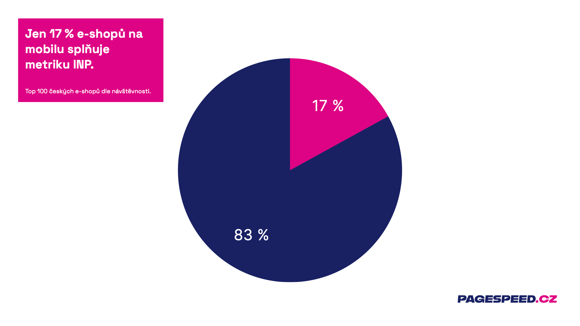
Globally, 95% of websites comply with FID ⨉ only 66% with INP. I'm afraid this might be a bit painful for the developer community in the next year, especially for sites built on JavaScript frameworks.
What are the main differences between INP and FID metrics?
- FID = first interaction × INP = entire page visit. You can't just react quickly to the first click. The worst of all counts.
- FID = first part of the reaction × INP = entire reaction. FID measures only the time until the click starts processing with JavaScript. INP waits until the page is redrawn to a new state.
Optimizing the INP metric on your site may take some time, so we recommend starting to focus on this topic soon. We now display INP in our speed tester, including its monitoring. Of course, we can also help you with optimizing this metric.
In the following tips, we'll move from technologies and metrics to tools.
8) Web Vitals Overlay, An Unobtrusive Yet Excellent Assistant
To allow developers to troubleshoot the right problems, you must know how to measure metrics correctly.
The Web Vitals overlay bar is significantly better for local testing than Lighthouse. It shows the correct metrics and they are accurately calculated.
It's important to realize that Lighthouse measures synthetically without special settings and therefore cannot correctly measure metrics gained from users throughout their entire page visit.
How to access the Web Vitals overlay?
- Open Chrome Dev Tools (F12).
- Cmd + Shift + P on Mac, or Ctrl + Shift + P on Windows.
- Start typing “Web Vitals Overlay”.
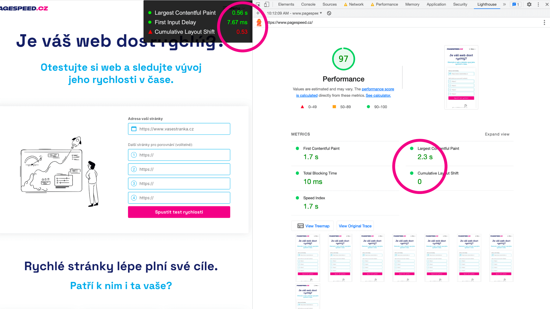
For metrics like CLS or the new INP, you won't get the same numbers you then see in Google data.
A reasonable alternative to the Web Vitals overlay is the Web Vitals extension.
9) Perf. Insights, A New Speed Tuning Tool
Performance Insights is like the Performance tab, but for people.
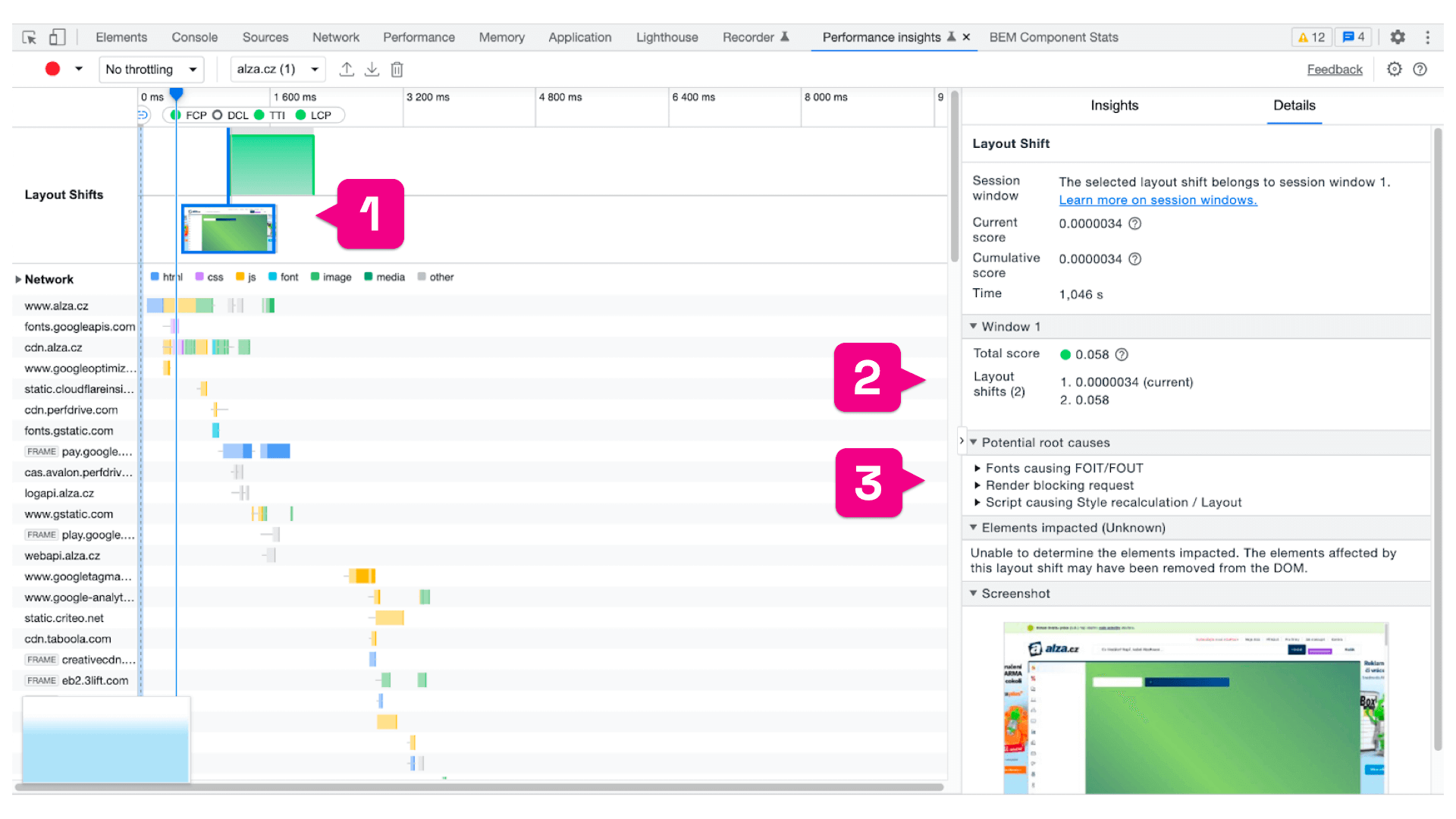
In Insights, Chrome shows specific information for tuning a particular metric, see for example with CLS:
- Specific unwanted shifts for CLS (1).
- CLS score (2).
- Potential problem causes (3).
If you need details for speed tuning and the Performance tab is too complex for you, consider Performance Insights.
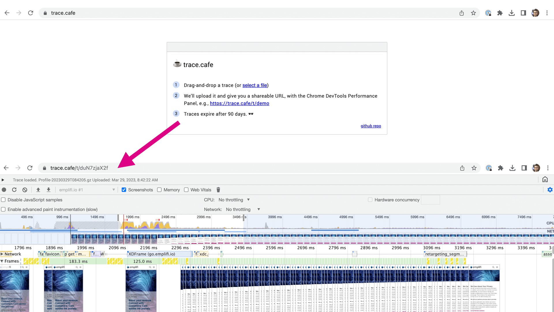
A very brief tip to end with. Trace.cafe allows you to share the output from Trace (Performance tab) at a specific URL.
Download the data in JSON, drag it into Trace.cafe, and share the resulting URL with colleagues. Paul Irish, the author of this great app, says your trace at the given URL will last three months:
And we've reached the end of this brief guide to the latest speed innovations for developers.
Would you like to receive more tips? Every month we release a newsletter, but we also publish on LinkedIn, Twitter, or Facebook.
How Fast Is Your Website?
How does your website speed compare to your competitors? Find out using our online tester.