CLS: How to Maintain Element Heights (Images, JS Components, iframes…)
 Radek ŠírUpdated 1/26/20266 minutes reading
In this guide, you will learn why and how to ensure dimensions for elements such as <img>, <iframe>, or JavaScript components that are asynchronously inserted into a page, using HTML or CSS.
Properly preparing space for these elements will help you avoid unwanted page shifts and thus prevent the deterioration of the Cumulative Layout Shift (CLS) metric, which is part of the Core Web Vitals.
Why is it Necessary to Monitor Dimensions and Aspect Ratios?
Every asynchronously loaded element on a page should have a defined size. This could be an image, video, iframe, or another web component.
When a page loads and the content is first displayed (the FCP event), the browser needs to have a defined space for this element before it is displayed.
Let's explore solutions for specific elements in more detail.
1. Images, IMG Elements
The most common problem with the CLS metric is missing dimensions for images. The browser knows nothing about an image until it is fully downloaded and then displayed. If you specify the width and height in the <img> tag, the web browser will allocate the necessary space for the image.
<img src="image.webp" alt="…" width="1600" height="900" />
Enter the physical dimensions of the image in pixels into the width and height attributes.
From these dimensions, the aspect ratio can also be calculated, so it works even for images inserted into responsive layouts. Whenever possible, always specify dimensions for images. This is especially important for images that are lazy-loaded and therefore have the loading="lazy" attribute.
Sometimes, for technical reasons, you may not be able to generate the width and height parameters in HTML. This can be substituted by using the CSS property aspect-ratio, which prepares the space by aspect ratio.
If you do not know the dimensions or the aspect ratio of the images in advance, you can use the trick with automatic aspect ratio.
.wysiwyg img {
	aspect-ratio: auto 16 / 9;
}
This aspect-ratio setting ensures that each image is set to an aspect ratio of 16/9, but once downloaded and rendered, the browser will respect the real aspect ratio of the image.
It is indeed better to reserve some space than to have no dedicated space at all.
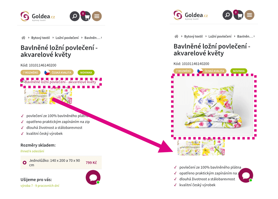 An image without set dimensions is initially rendered with the wrong height, then shifts the content below it, causing a layout shift.
2. JavaScript Components on Your Website
These may include various calculators, image slideshow viewers, carousels with offers, and similar components. It may happen that this element is not rendered immediately in the first render of the page, but its display is deferred, for example, by lazy loading or its content is loaded asynchronously using JavaScript.
Always reserve space in the layout for these elements in advance. If the content is loaded later using JavaScript, prepare space for the element using the CSS property aspect-ratio or min-height in the styles file.
When the aspect ratio is known:
.box {
	aspect-ratio: 16 / 9;
}
When the aspect ratio is unknown, insert an estimated minimum height:
.box {
	min-height: 200px;
}
3. Third-Party JavaScript Components
Typically, these are some social plugins like Instagram, Facebook, TikTok, Google reviews, YouTube videos, etc.
These widgets are often not rendered immediately in the first render of the page, but their display is deferred just like the components in the previous section.
Always reserve space in the layout for these elements in advance as well. If you do not know the aspect ratio or exact dimensions, you can use at least the CSS property min-height to prepare some minimum height.
Check the display with a "typical post" and set the minimum height of this component accordingly. It is always better to prepare some space than none at all. You may not completely eliminate all layout shifts, but you will significantly reduce their impact on the CLS metric.
 If you use the Google review widget, prepare space for it on the page before the actual data loading.
Mini Case Study: External Service Carousel on Datart
Datart.cz, in collaboration with PageSpeed.ONE, managed to significantly improve unwanted layout shifts on the homepage. The problem was a carousel loaded using an external service, Bloomreach, which loaded after the first page render and shifted the content below it.
The solution was relatively simple, but not easy to implement on the existing setup. We reserved space for the carousel using the CSS property min-height before it was loaded. Thanks to this adjustment, the CLS value on the homepage decreased from 0.6 to 0.06, representing a tenfold improvement.
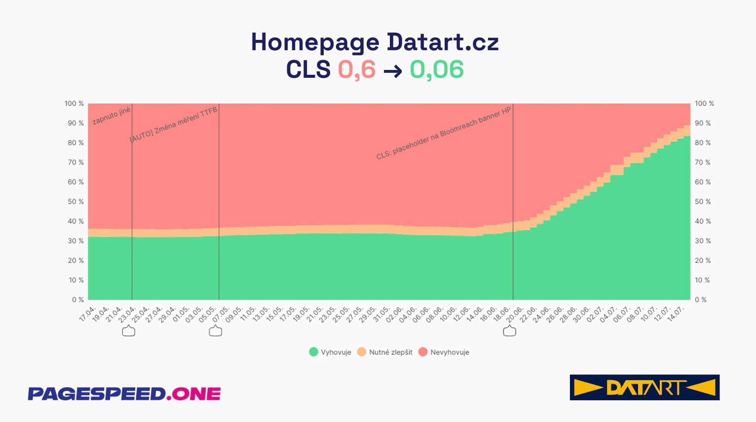 The graph shows the evolution of the CLS metric on Datart's homepage. The share of non-compliant measurements (red area) dropped from about two-thirds of page views to a minimum, while the share of compliant measurements (green area) increased to over 80%.
How to Test for Missing Dimensions or Aspect Ratios
1. Local Measurement Using Chrome DevTools
With the Performance panel, you can live track changes in the CLS metric. The panel will also inform you of the source of the problem.
In this case, it is ideal to slow down the network in the settings. This setting will quickly reveal images and components without dimensions, as resources will take longer to load.

2. Synthetic Tests with Lighthouse Tool
Synthetic tests with the Lighthouse tool, which you can also create with our PLUS speed monitoring, will indicate which images lack dimensions and may potentially cause problems for the CLS metric.
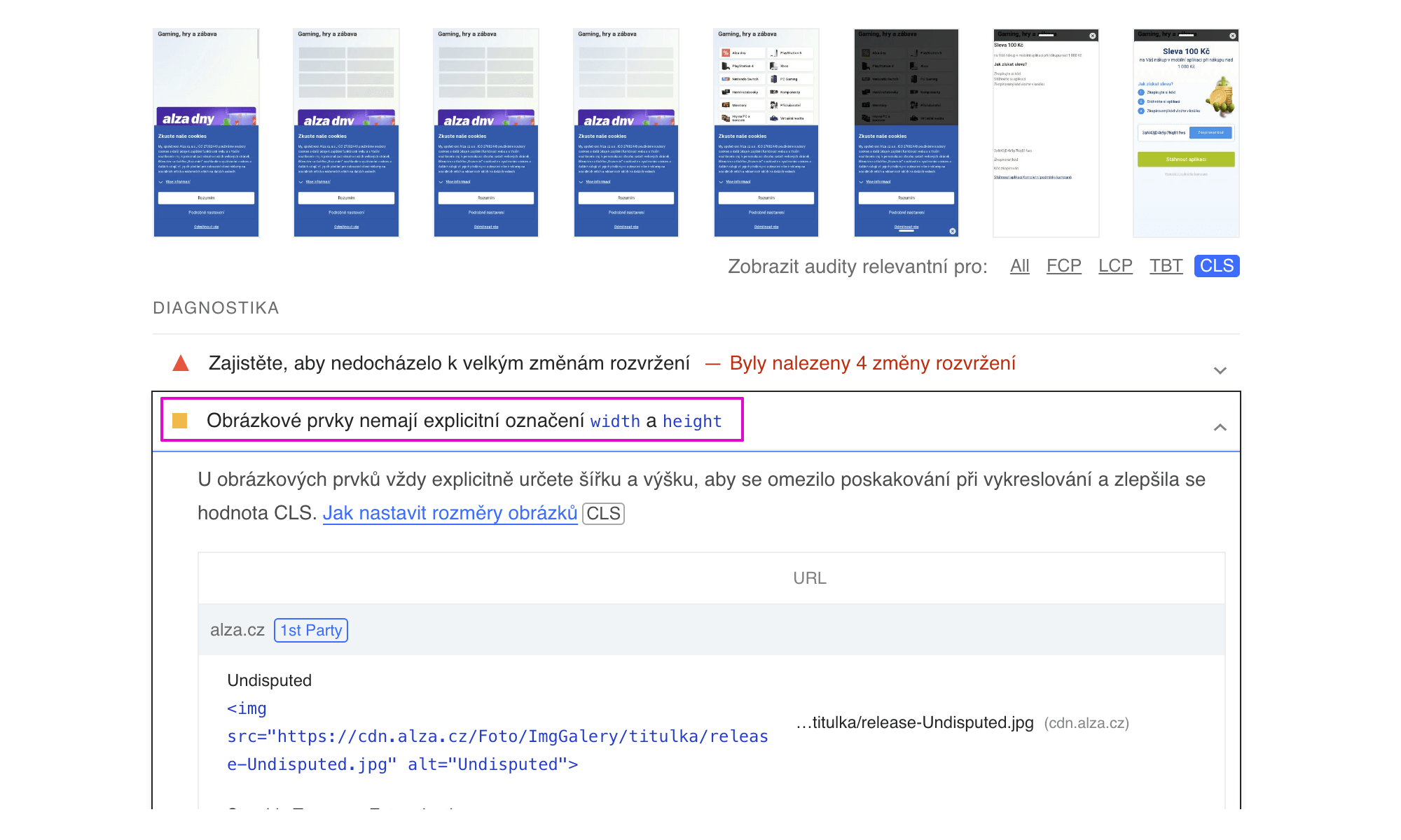 Lighthouse test results where you can see the impact of elements from the visible part of the screen on CLS.
In the test run details of our PLUS speed monitoring, you can see the results of the Lighthouse report and thus determine which elements affect CLS.
Ensuring height or aspect ratio is among the fundamental methods to avoid unwanted page shifts and deterioration of the Cumulative Layout Shift (CLS) metric.
In our guide, you will also find other methods for optimizing the CLS metric.