Chrome UX Report: Google Users' Speed from A to Z
 Zuzana Fatrdla
 Martin MichálekUpdated 7/28/202610 minutes reading
The Chrome UX Report (CrUX) is a public data set provided by Google, collecting and anonymously analysing real user experience data while browsing the web using the Chrome browser.
 Google's Chrome UX Report.
CrUX focuses on critical metrics such as loading speed, interactivity, and content stability, providing valuable insights into how websites perform in real-world conditions.
Beyond the basic Core Web Vitals metrics (LCP, INP, CLS), CrUX now offers extended data, newly added to our Domain report monitoring. This gives you deeper insights into your site's real-world behaviour, including user segmentation by device, page load types, and specifics on what hinders images for LCP.
CrUX vs. RUM and Synthetic
CrUX isn't the only way to measure real user speed. Differences between measurement types, their strengths, weaknesses, and recommended combinations are detailed in our synth vs. CrUX vs. RUM article.
However, the Chrome UX Report is authoritative for SEO and PPC. Google collects this data and uses it as a signal in search rankings and Google Ads Quality Score.
How is data measured in the Chrome UX Report?
CrUX gathers data directly from the Chrome browser users who haven't opted out of data sharing. Both domain and URL must have sufficient traffic for CrUX data to appear. Data is aggregated at the page and domain level and includes additional information about connection speed, region, and more.
This makes CrUX the only officially reported web speed source affecting your ranking and ad pricing. But even CrUX has its limitations, which need practical consideration:
- 28-Day Moving Average
Technical changes impact CrUX values with a delay of several weeks. CrUX won't tell you "INP improved today"; it will show a gradual curve shift. - Device Segmentation
Data is collected separately for mobile, tablet, and desktop. The average user profile differs significantly across these. - Visibility Threshold
Sufficient traffic (estimated 10–15 thousand views per month) is necessary for domain or specific URL data to appear in CrUX. - SPA vs. MPA
In Single Page Applications, CLS and INP are measured cumulatively for the entire session, not just the first load. CrUX values are often worse for SPAs than traditional MPAs, even if "speed" feels similar. Details on measurement in Chrome are further explored on web.dev's page about SPA and Web Vitals.
For debugging specific issues, CrUX data isn't sufficient. Use synthetic or, in more advanced cases, RUM measurement for all users.
Conversely, in PageSpeed.ONE, we use the Chrome UX Report as authoritative metrics for business decision-making (SEO impact, prioritization) and as a reference framework against which you compare synthetic and RUM results.
Why are Chrome UX Report data important and where are they used precisely?
CrUX is a crucial resource for developers, SEO experts, and digital marketers as it provides insights from real user data. From our experience, speed impacts are most evident in:
- SEO
Google includes Core Web Vitals user experience metrics in evaluating web pages in search results. Better performance can lead to better search rankings. - PPC Campaign Ratings
Website speed affects bounce rate and overall PPC campaign effectiveness. Speed can also influence the cost of Google Ads. - Speed Measurement (UX)
CrUX provides real data on page loading speeds, enabling developers to enhance user experience. Analysing this data and optimising can accelerate the web, leading to higher user satisfaction. It also allows for easy comparison with competitors.
Why Page Speed? – all reasons in one place.
What metrics does the dataset contain?
Google collects data separately for mobiles, tablets, and desktops. CrUX includes information on Core Web Vitals metrics, which comprise these key metrics:
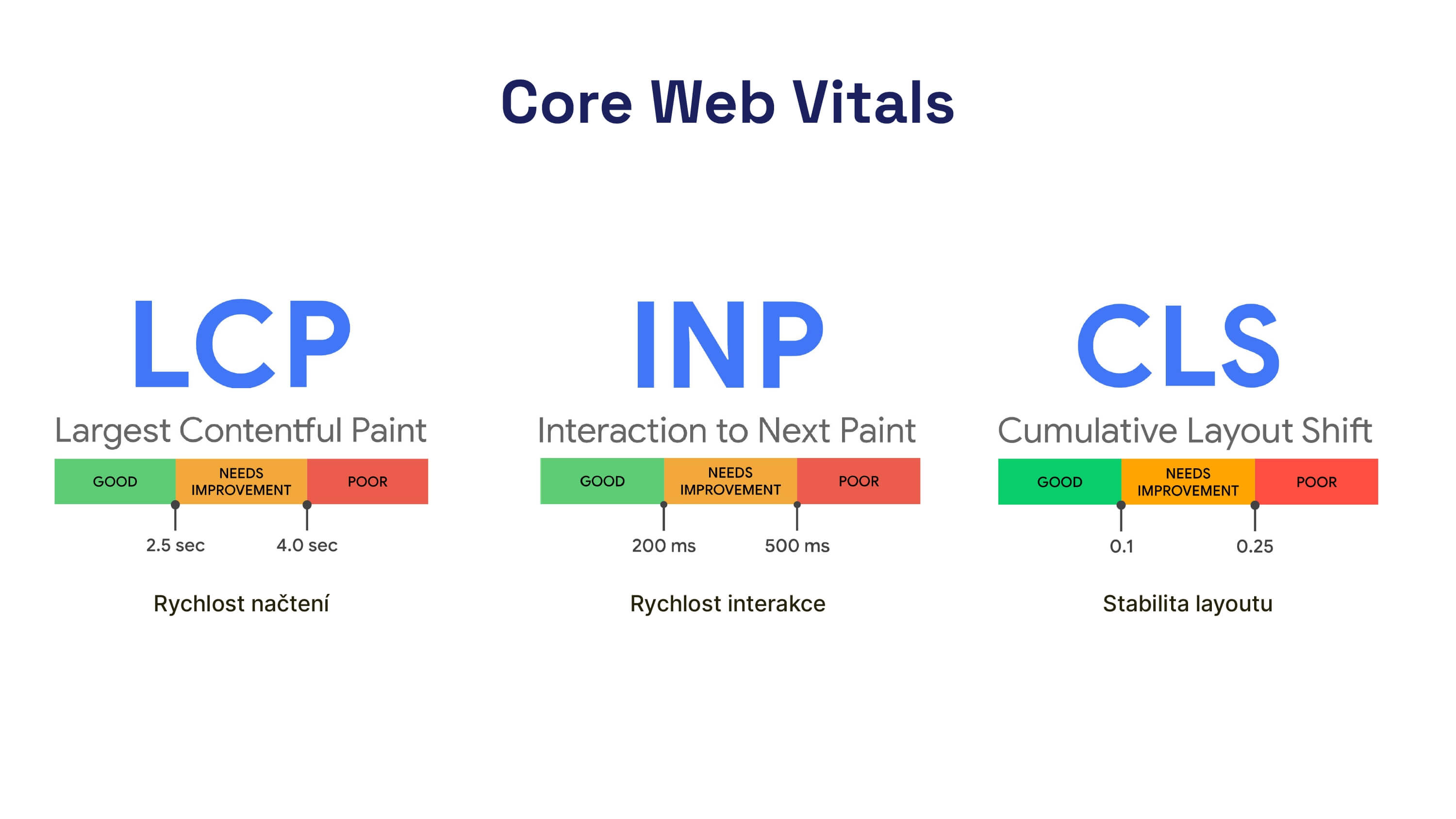 Core Web Vitals Metrics: the fundamentals of all web speed metrics.
We further discuss additional values available in the dataset below.
Origin vs. URL: Data Granularity
The Chrome UX Report provides data at two page levels. Understanding the difference is crucial for correct interpretation:
- Origin (e.g.,
https://www.example.com) returns aggregated data across the entire resource, including all subpaths and localizations (/en-us,/fr,/product/…). The origin gives a cross-section of the entire domain. - URL (e.g.,
https://www.example.com/en-us) returns data only for that specific URL. It does not include subpages (/en-us/product/abc).
To group URLs by pattern, use Google Search Console, which works with its own URL group division. How to read its speed reports is shown in the Google Search Console and Core Web Vitals guide.
In practice, you may encounter situations where CrUX data is missing, typically for three reasons:
- Insufficient Traffic
Without ~10–15 thousand page views per month, data won't appear in CrUX, either for the entire domain or a specific URL. noindexon Homepage
If the homepage is markednoindex, CrUX won't report origin data.- Redirect from Root Page
If the root automatically redirects to a subpage (e.g.,domain.comtodomain.com/welcome) and the original root isnoindex, CrUX may not follow the redirect. Result: origin data disappears, even if/welcomeitself is fine.
Advanced Metrics and Navigation Types
Today, CrUX offers more than just the three Core Web Vitals metrics. Among the advanced data, we most frequently use:
- RTT (Roundtrip Time) separates the backend's impact from the network's. If you have a high RTT but reasonable TTFB, the user's connection to the server is the bottleneck, and considering a CDN might be wise.
- LCP Image Subparts show which part of the LCP image loses time. By breaking it down into server delay, download time, and rendering, you can easily determine whether a better backend, smaller image, or
fetchprioritywill help. - LCP Resource Type distinguishes whether the LCP is an image or text/webfont. This decides where to direct optimisation – either image preload or critical font preload.
- Navigation Types show the share of different navigation types. An increase in BFcache and prerender share via Speculation Rules shifts LCP and INP values towards zero, as "instant" navigations are counted as fast in CrUX.
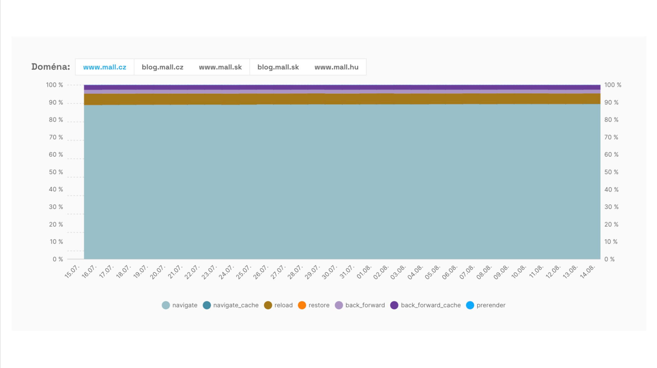 Tracking the share of various navigation types allows us to see the portion of fast or instant navigations.
We implemented Speculation Rules in PageSpeed.ONE for Innogy, where the increasing share of instant navigations significantly improves values for the whole domain. A recipe for keeping the INP metric under control can be found in INP optimisation.
Data Delay in CrUX
Chrome UX Report data isn't real-time. Data enters CrUX with up to a month's delay from the end of the reporting period, depending on the dataset:
- Monthly Dataset (CrUX BigQuery) is published on a fixed day (e.g., the second Tuesday of the month) and contains data for the previous calendar month.
- CrUX Daily is more current. Today you'll see data for yesterday. However, it uses a 28-day moving window.
Histogram of Metric Values Distribution
The 75th percentile of a metric (e.g., 2.1 s for LCP) and three colour categories (portion of users for whom the metric is acceptable, needs improvement, unacceptable) are merely a summary of the overall speed picture among users.
A Histogram goes a level further. It shows what portion of users (or more precisely, page views) had a specific metric value in the last month. It reveals how many users experienced the metric at a given value.
This is an advanced perspective. It makes sense if you understand percentiles, the shape of distribution, and you're thinking about speed optimisation at the user segment level, not just a single number. For everyday monitoring, the state of metrics and their trend over time suffices; consider the histogram a diagnostic detail.
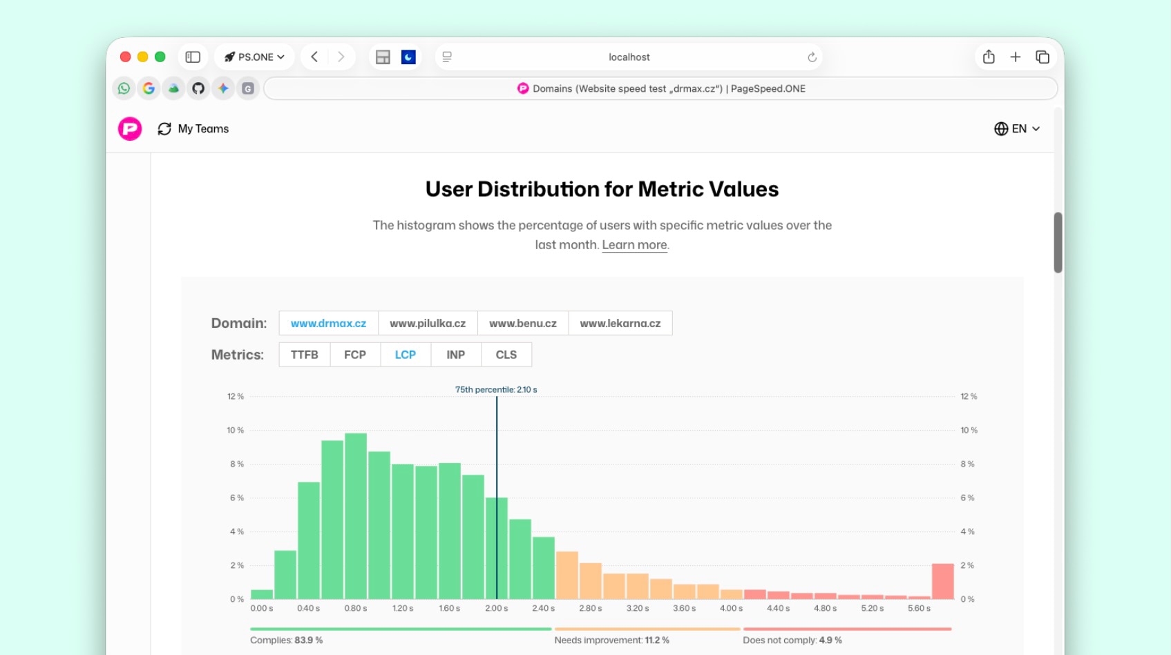 Histogram in PageSpeed.ONE's Domain Report.
Where can you find the CrUX histogram?
In PageSpeed.ONE, you can find the histogram in the Domain Report. The same type of view (distribution of CrUX values) is available in other tools like Treo or directly in the source data set for the Chrome UX Report.
Why monitor the histogram?
The 75th percentile is just one number. The histogram shows whether the bulk of users is just below the threshold, whether a green 75th percentile hides a large orange or red mass, or if the problem is caused by a thin "tail" of extremely slow views. Without knowing the distribution shape, you might easily optimise the wrong segment.
How to read the shape of a CrUX histogram?
The histogram shows the last month's CrUX data without a period switch. It's not a "before and after" comparison in this graph – daily and monthly trends serve that purpose. However, from a single snapshot, you can infer:
- Close to the threshold vs. deep in the red – a majority of "bad" values just over the limit often means a minor tweak suffices; a mass far in the red zone suggests structural or template issues.
- Multiple peaks – typically different segments (cache vs. non-cache, different templates, geographical differences). For TTFB, a classic double distribution is described in backend optimisation.
- Thin right tail – a few catastrophic views vs. a shift of the entire mass to the right (issue across the web).
- Metric by metric – for LCP, focus on any second peak; for INP, a long tail of heavy interactions; for CLS, a peak at zero and a thin tail vs. a shift of the entire distribution.
- Domain comparison – the same 75th percentile and a different shape = different optimisation priorities (most slow vs. most fine and a few disastrous).
Relationship of the histogram to PageSpeed.ONE score
PageSpeed.ONE Score (SPS) already considers the entire user distribution in its calculation, not just the 75th percentile. The histogram is a visual drill-down per individual metric: you see the shape from which SPS (and Google) derive.
Where can Chrome UX Report data be found?
Many tools work with CrUX data. They differ in recency, metric support, and clarity. In practice, we recommend starting with our web speed test tool (Insights). You'll get a clear UI, PageSpeed.ONE Score (SPS) as a single summary number, CrUX data trend over time, and integration of synth and CrUX data in one dashboard:
Measure your website speed
The website speed test shows you the results straight away.
Other ways to obtain CrUX data include:
- CrUX Vis is an experimental Google tool for CrUX visualisation. Suitable more for specialists seeking flexibility over clarity.
- Google's PageSpeed Insights shows data but doesn't provide trends over time. It's fine for a one-time check, less so for monitoring trends.
- Google BigQuery provides raw dataset access for advanced analysis using SQL. There is also a CrUX History API, returning weekly data and faster than ad-hoc BigQuery queries.
How do we use CrUX data in PageSpeed.ONE monitoring?
CrUX data reports from PageSpeed.ONE's PLUS monitoring show, for instance, the status of metrics on a dashboard and the trend of values on domains:
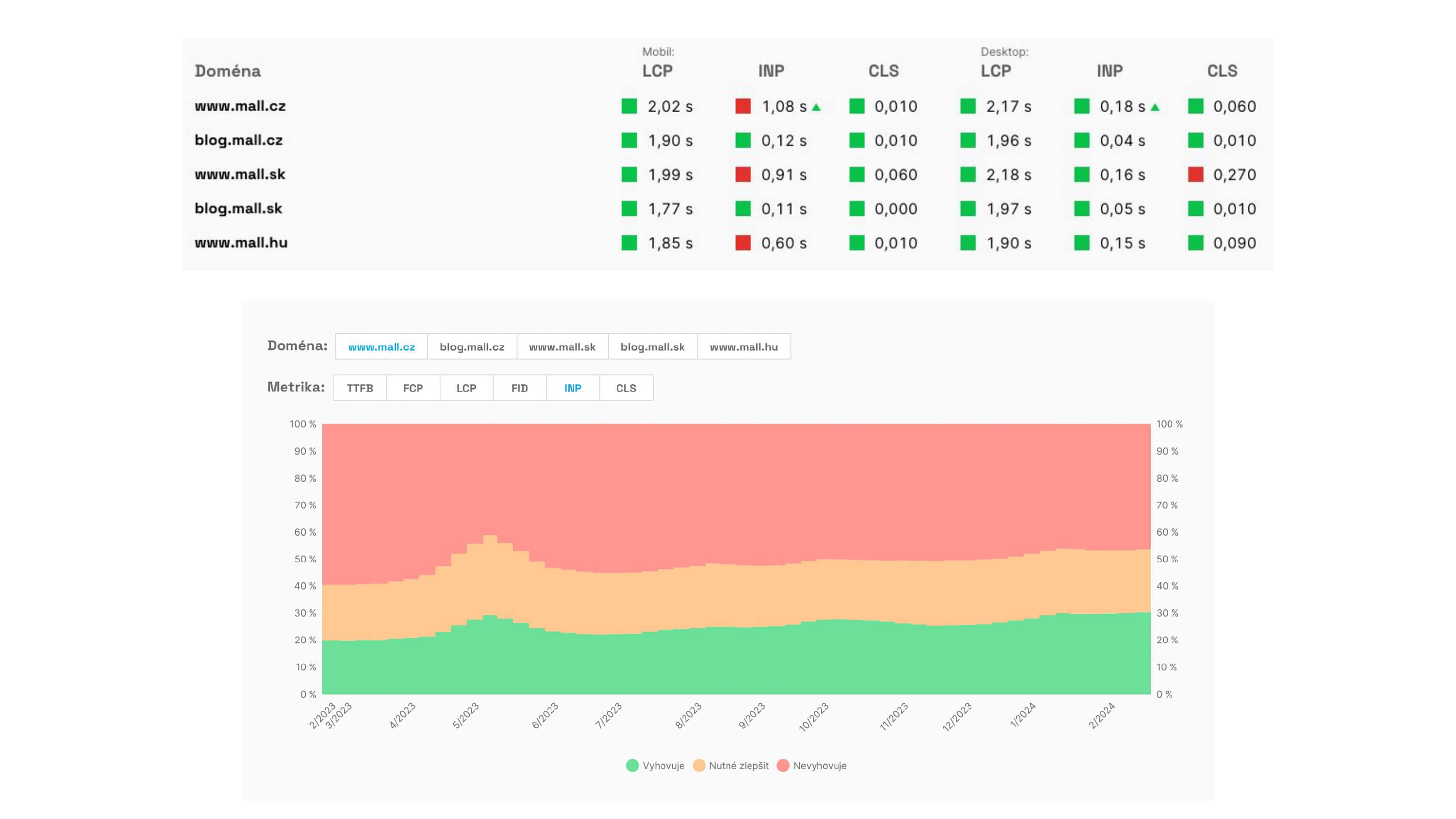 Speed trend according to CrUX data in PageSpeed.ONE's speed monitoring.
Monitoring CrUX data is crucial for all websites that have this data. In our Domain Report, you'll find, among other things:
- Core Web Vitals (LCP, INP, CLS) metrics.
- Additional speed metrics (FCP, TTFB, RTT).
- Histogram of metric value distribution – detailed view of value density over the last month.
- User segmentation by device type (mobile, tablet, desktop).
- Segmentation of page load types (navigate, reload, bfcache, prerender…).
- LCP metric source type (image vs. text).
- Reasons for delays in images that are LCP elements.
- The development of this data over days and months.
Together, this information paints a picture of how your users truly experience web speed and where there's room for improvement. If you prefer tracking a single summary number instead of individual metrics, we recommend PageSpeed.ONE Score (SPS), which is based on CrUX data and considers the entire user distribution, not just the 75th percentile.