The Cumulative Layout Shift (CLS) Metric: How to Identify and Eliminate Unwanted Page Shifts
 Radek Šír
 Martin MichálekUpdated 7/28/20268 minutes reading
Fed up with ads that push the text you're reading out of view? Annoyed when content jumps just as you’re about to click, making you click elsewhere?
These pesky interruptions are known as layout shifts. All such shifts on a single page contribute to the Cumulative Layout Shift (CLS) metric.
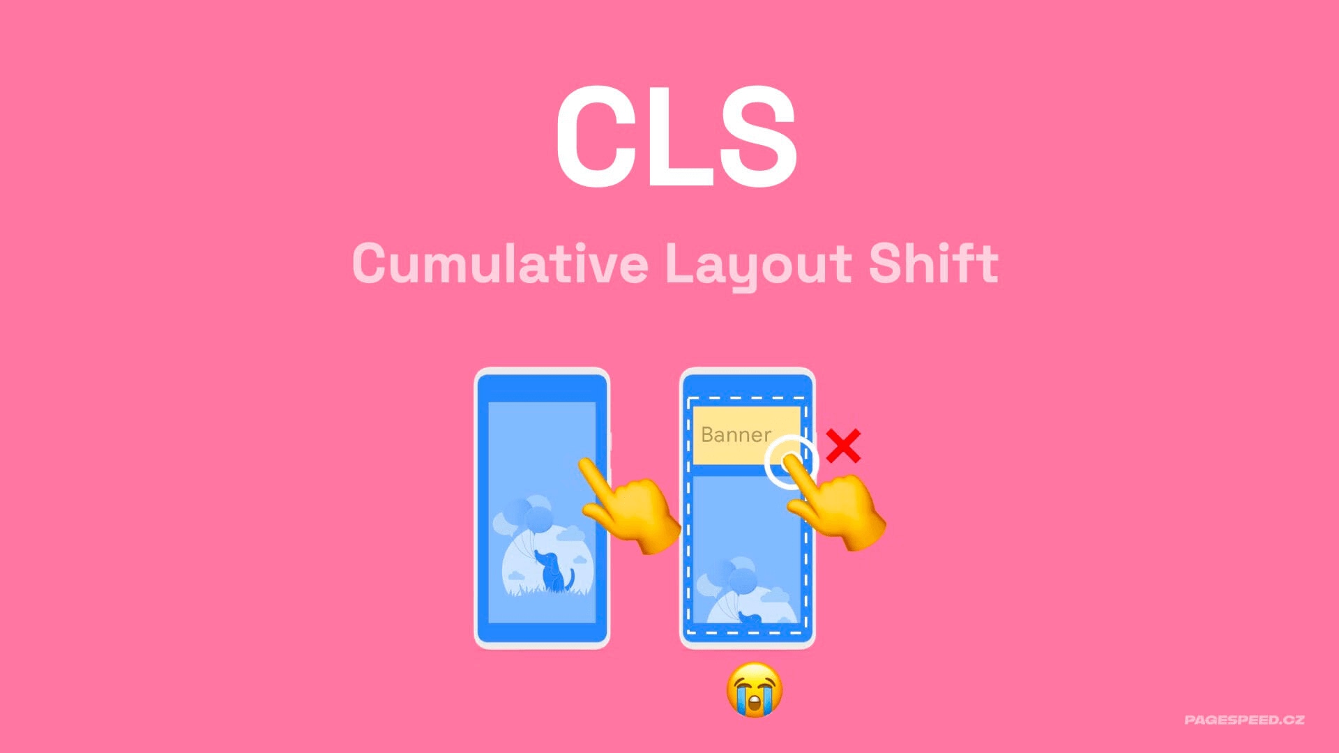
Let's delve deeper into this metric.
Understanding the CLS Metric
Optimising for CLS aims to achieve maximum visual stability during page rendering and subsequent user movement on the page. This makes it easier for users to consume your content.
Technically, the definition is a tad more intricate: CLS measures the cumulative layout shifts within the worst five-second window during the page experience.
This metric is part of Core Web Vitals, used by Google to assess web page quality. Core Web Vitals are among the signals considered in search ranking.
The CLS Value Threshold is 0.1
To keep your Cumulative Layout Shift in the favourable green zone, the metric value must be under 0.1. Achieve this, and you’re in the clear.
A CLS of 0.1 - 0.25 places you in the orange zone, indicating improvements are necessary.
If user data shows a value exceeding 0.25, Google deems your CLS unsatisfactory.
| Good | Needs Improvement | Poor | |
|---|---|---|---|
| CLS | < 0.1 | 0.1 - 0.25 | > 0.25 |
The Importance of a Good CLS Score
The Cumulative Layout Shift (CLS) metric might be significant for your site:
- CLS affects SEO and ad pricing due to its inclusion in Core Web Vitals.
- Optimising CLS increased Yahoo! JAPAN News page views per session by 15%, as detailed in a case study on Web.dev.
- Mail.ru improved their conversion rate by 10% by optimising this metric, see study.
- CLS also impacts the Lighthouse score. In Lighthouse tools from version 10, CLS contributes 25% to the overall score (LPS), akin to the LCP metric.
Some of our clients have seen increased traffic post-CLS optimisation.
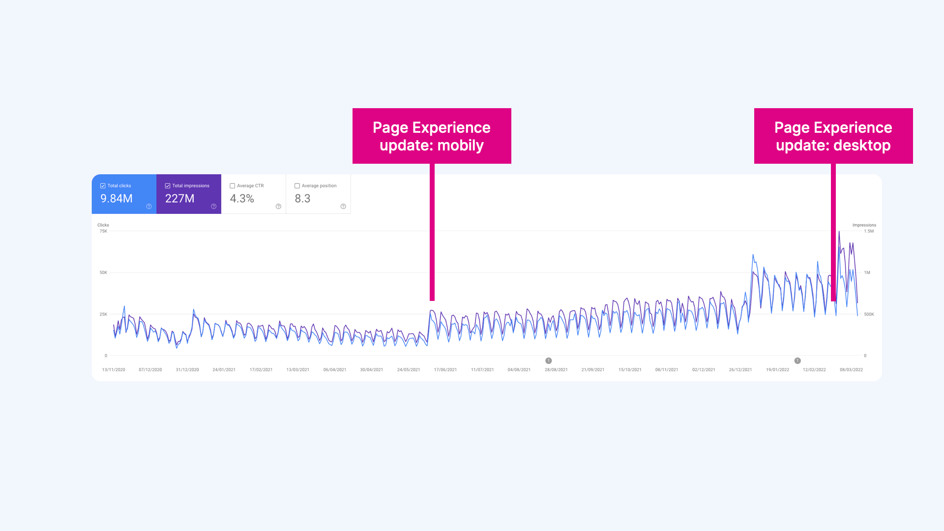 On a content-driven site, we achieved "green Core Web Vitals". Following Google's Page Experience update, traffic surged significantly.
How is CLS Calculated?
First, let’s understand what a layout shift entails.
 Cumulative Layout Shift
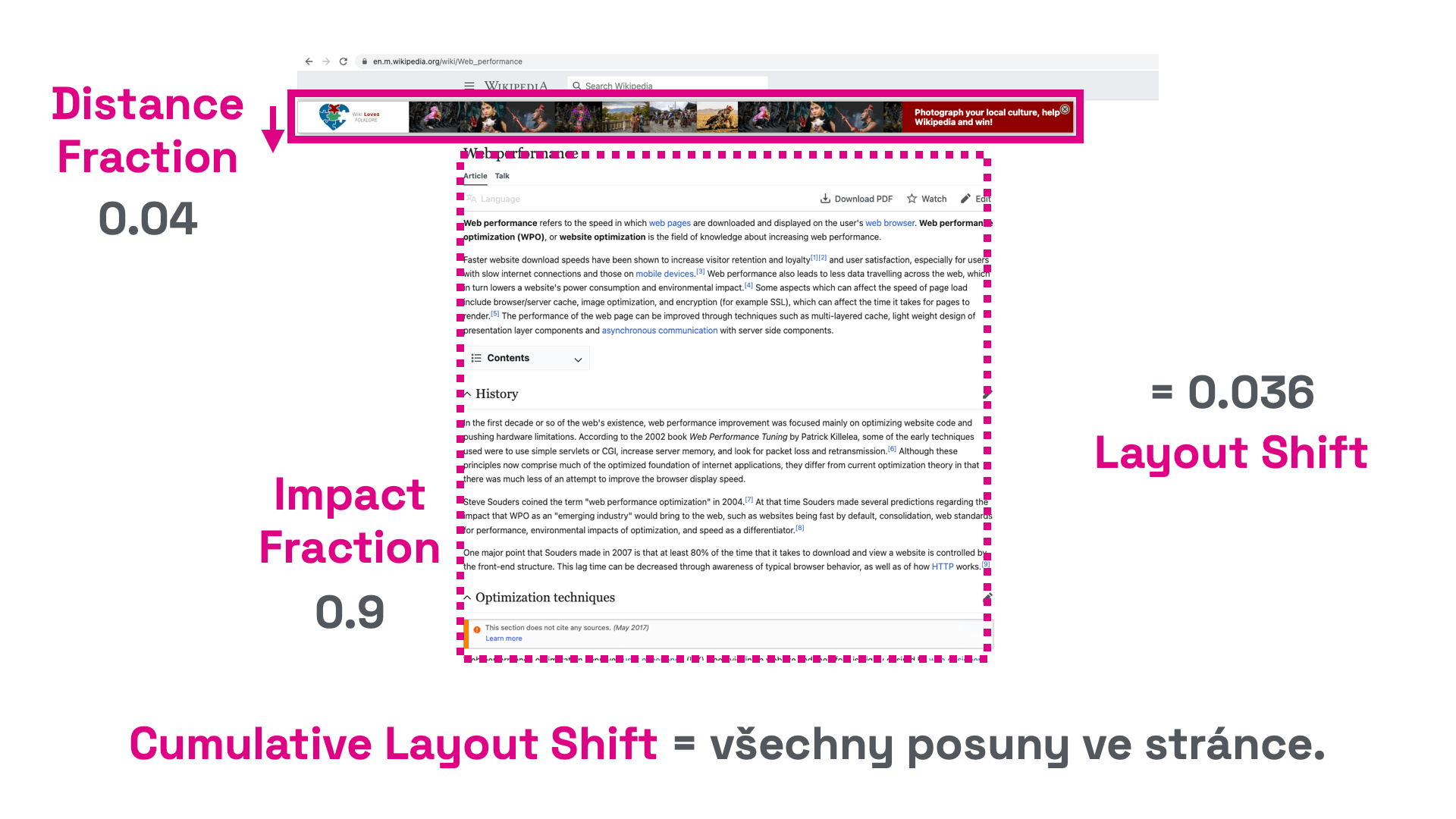
- Individual layout shifts are calculated from the total affected area size (Impact Fraction) and the distance the unstable element shifts (Distance Fraction) on both the X and Y axes.
- In the example below, the unstable element covers about 90% of the viewport.
- The element shifts by 4% of the viewport's total height. The shift distance is thus
0.04. - In this case, the total affected area size is
0.9, with a shift distance of0.04. - The layout shift in this instance is
0.04 * 0.9 = 0.036.
Multiple such elements may exist on a page – hence the "Cumulative" in the metric's name.
Tip: Why have a fast website? It might boost your conversions and traffic.
Enter the “Session Window”
It’s crucial to note that the Chrome UX Report considers CLS for the user's entire page visit.
Currently, however, the total CLS score is limited to the maximum CLS recorded within a session window capped at 5 seconds with a 1-second gap. Simply put, it considers the worst five seconds:
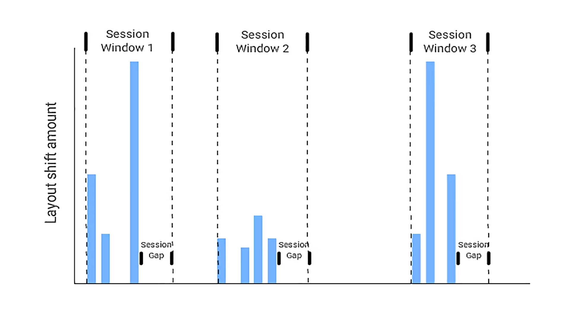 Calculating the CLS metric. Only the worst window is considered. Here, Session Window 1.
- Unwanted shifts (layout shifts), as described above, are always counted within session windows lasting a maximum of five seconds.
- If a second passes without shifts, the window concludes before the five-second mark.
- Throughout the entire URL visit, only the worst window is selected (in the image, the very first one). This is reported as the CLS score for the page.
Calculating during individual sessions prevents unnecessarily high CLS values during long visits to a single URL.
More information on CLS measurement can be found on web.dev.
How CLS Comes to Be
In practice, unwanted shifts are usually caused by these common factors:
- Shifts from progressively loading elements within content. These are elements without predefined dimensions, like images or JS components.
- Poor animations and shifts using CSS properties. Avoid CSS animations that do not support transformations.
- Failure to complete a requested shift within 500 ms. If you can't redraw content in time, at least prepare space for new content. This applies to things like AJAX pagination.
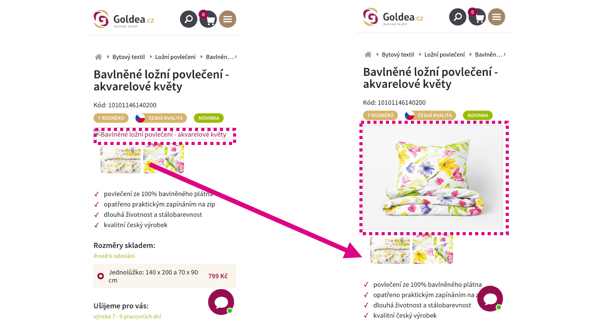 Beware of asynchronously loaded elements like images. They love to shift.
Measuring CLS
Chrome UX Report
Ideally, gather CLS data from almost all your visitors using the Chrome UX Report. It returns the 75th percentile of CLS values for all page views on your domain. A more detailed look at the value distribution is available in the histogram.
This data includes measurements from Chrome users, both desktop and mobile. Measurements from users on Apple products are not included.
Data from the Chrome UX Report is accessible in tools such as our web speed test, PageSpeed Insights, or Google Search Console.
Chrome DevTools
A great option for developers and advanced users is to measure CLS locally on each page individually. Chrome is ideal for this; enable the Web Vitals extension and start measuring immediately.
Initially, measure the first CLS in the initial viewport and gradually move to interactions like scrolling and clicking on site elements.
PageSpeed Insights or Lighthouse
PageSpeed Insights or Lighthouse can measure CLS on individual pages of your site in the initial viewport. It's an excellent starting point for refining basic layout elements, menu shifts, mobile headers, ad banners around the site, and so on.
The downside is that they measure CLS only in the first viewport, while we aim to measure cumulative shifts.
Practical Recommendations to Avoid Layout Shifts
From our web speed consultancy experience, here are some recurring issues:
Always Specify Size for Images and Asynchronous Elements
Ensure that all images on the site have defined width and height using width and height attributes. For asynchronous elements like JS components or ads, use the CSS property aspect-ratio.
Don't Embed Third-Party Components Without Placeholders
Always prepare space using placeholders before initializing ad systems or social media plugins (Facebook, Instagram, TikTok), or again use the aspect-ratio property. Set placeholder dimensions to reserve a similar area as the plugin-generated content.
Leverage BFcache
Allow the browser to use BFcache to reduce the CLS score on your site. This way, when navigating browsing history, the browser doesn’t need to re-render the page and displays it from memory, avoiding all rendering shifts. This cache has been around for some time, but Chrome started supporting it on mobiles and desktops from 2023.
Fine-Tune Custom Fonts
Replacing system fonts with custom ones often causes unwanted shifts.
Here are a few recommendations:
- Fewer individual cuts and variants are better.
- Start downloading fonts as early as possible.
- Use preload for prioritising download.
- Exclusively use the modern WOFF2 format.
- Ensure text readability before the external font is fully loaded using the
font-displayproperty. - Align the external font with the placeholder system font using
size-adjust.
Respond to Requested Shifts Within 500 ms
If clicking on JavaScript redraws part of the page and the new content differs in size from the original, nearby elements will shift. This shift must occur within 500 ms.
This applies to, for example, AJAX pagination. If you can't safely deliver new content within this time on slower devices, shift surrounding elements immediately upon clicking and insert the actual content in the prepared space later.
Place CSS in the <head>
Keep CSS styles in the header whenever possible. They'll be processed at the start of page loading all at once. Adding additional CSS properties inside the HTML document can lead to further layout shifts due to the progressive processing of these styles.
Reserve Space for Icons
Using IconFont or SVG sprite with many icons can result in a lengthy download. Only after these substantial files are loaded do icons appear on the site and can start shifting content. Always define icon dimensions before loading.
Use transform for Animations
The CSS transformation property allows animating elements without causing layout shifts. Instead of changing height and width properties, use transform: scale(). To move elements, avoid changing top, right, bottom, or left properties and instead use transform: translate().
Final TIP: Case study on CLS optimisation on our client Goldea.cz's site by Martin Michálek from the Webexpo 2023 conference.
Bonus: Beware of Scrollbars
If you measure a CLS of 1.00 immediately after the page loads and can't figure out what else to optimise, try overflow-y: scroll. As HTML and CSS files are progressively processed, the side scrollbar may toggle on and off.
Add this snippet to your CSS styles; it might save you a lot of nerves searching for other CLS causes.
html { height: 100%; overflow-y: scroll; }
The CLS metric is part of our unified speed metric, PageSpeed.ONE score (SPS).
More on CLS optimisation is available in a separate article.
We Can Help with CLS
On the SIKO website, we managed to improve layout stability by sevenfold. Website speed is crucial for SIKO, but the new JavaScript-based frontend exhibited significant issues with Core Web Vitals user experience metrics.