Web Font Optimization: 6 Steps to Speed Up Your Site
 Martin MichálekUpdated 9/29/20255 minutes reading
The world of web fonts is much like a beauty salon – we all want the best, but we’re not always willing to wait while the stylist finishes their work. And your visitors? They’re particularly impatient.
When fonts load slowly, users don’t see your carefully chosen text but rather a blank page or unsightly content jumping. This might convince them that your website was crafted by a hairdressing intern on a Friday afternoon.
Let’s explore how to turn web fonts into an asset instead of a speed bump.
Why Bother with Font Optimization?
Fonts are not just about aesthetics. They are digital data that users must download before they can see your text. And since text is usually one of the first things visitors want to see, fonts directly impact two key metrics:
-
Largest Contentful Paint (LCP) – the time it takes to render the largest visible element on a page. Often, it’s the text waiting for the font to load.
-
Cumulative Layout Shift (CLS) – the extent to which content “jumps” during loading. If the font loads later than the rest of the page, the text might suddenly change size and disrupt the entire layout.
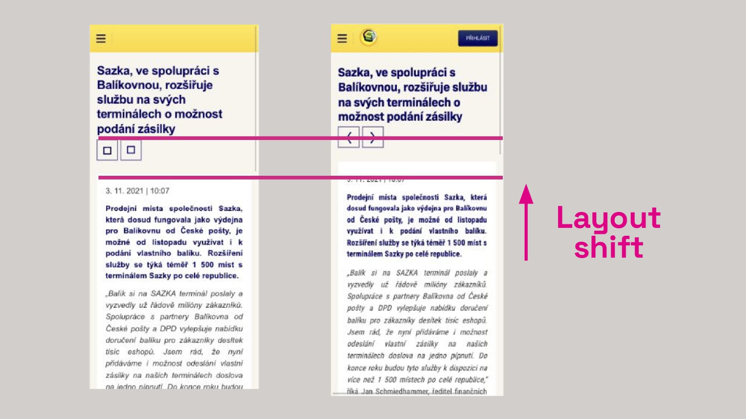 CLS is not a peculiar acronym but an electric shock for users when text jumps just as they’re about to read. (From our font optimization for Sazka.cz)
6 Steps to Fonts That Don’t Slow Down Your Site
1. WOFF2: The Only Format You Need Today
If your fonts are still traveling the internet in outdated formats like TTF or EOT, it’s time for an upgrade.
WOFF2 offers up to 30% better compression than older formats and is supported by all modern browsers.
@font-face {
	font-family: 'MyFont';
	src:
		url('myfont.woff2') format('woff2'),
		url('myfont.woff') format('woff'); /* For browsers from the Jurassic period */
}
If you’re concerned about very old browsers, include the WOFF format as shown in the code example, though it’s not strictly necessary.
2. Subsetting: Don’t Burden Users with Unseen Characters
Most fonts contain hundreds to thousands of characters for various languages. If your site predominantly uses Czech text, why force visitors to download support for Chinese or Arabic?
With tools like Glyphhanger, you can create a “lightweight” version of the font containing only the characters you actually use. The result? The font can be up to 10× smaller.
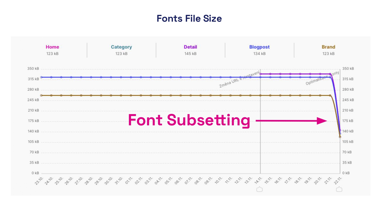 A practical story: by using subsetting and reducing the number of font weights, we decreased the font data volume on Trenýrkárna.cz by hundreds of percent. You’ll notice the difference from the first visit.
For multilingual sites, you can prepare language-specific subsets and load them conditionally based on the current language of the page. This is what we do at PageSpeed.ONE as part of our speed analyses.
3. Preload Critical Fonts: Priority for What Users See First
Some fonts are more important than others. Fonts for H1 headings or text in the first visible part of the screen (above the “fold”) deserve faster loading.
Using the preload directive, you can tell the browser: “I need this as soon as possible”:
<head>
	<link rel="preload" href="critical-font.woff2" as="font" type="font/woff2" crossorigin />
</head>
Caution: Use preload only for truly critical fonts. Each preload occupies part of your site’s “speed budget”.
4. Say No to Jumpy Text: Master font-display
The font-display property determines how the browser behaves while waiting for a font to load. You have several options:
-
swap– text initially displays with a fallback system font, then switches to the web font upon loading. Fast, but may cause jumping (CLS). -
fallback– a brief period of “invisibility”, then a system font, and if the web font loads in a reasonable time, it’s applied. -
optional– the browser decides if the font should be downloaded and used. Suitable for less important fonts.
@font-face {
	font-family: 'MyFont';
	src: url('myfont.woff2') format('woff2');
	font-display: fallback; /* Choose your own */
}
It’s also important to select a suitable fallback font with dimensions similar to your web font. This minimizes content jumping when switching.
5. Variable Fonts: One File to Rule Them All
Are you using a single font on your site in three different weights? The traditional approach means downloading three separate files.
Variable fonts allow multiple weights in one file, which can significantly reduce the total data size.
@font-face {
	font-family: 'VariableFont';
	src: url('var-font.woff2') format('woff2-variations');
	font-weight: 100 900; /* Range of supported weights */
}

.bold-text {
	font-weight: 700;
}

.medium-text {
	font-weight: 400;
}
6. What Isn’t Measured Can’t Be Improved
How can you tell if your fonts are slowing down your site? Use Lighthouse in Chrome DevTools or our PageSpeed PLUS monitoring, which shows you the evolution of font data size and the impact of fonts on LCP and CLS.
Website speed isn’t a one-time affair. With every new feature, image, or font, it can degrade. Our PageSpeed PLUS monitoring continuously tracks your site’s performance and alerts you when metrics start to deteriorate.
In Chrome DevTools, you can monitor font loading in the “Network” tab and filter by “Font” type.
Don’t Underestimate Font Optimization on the Web
Font optimization isn’t just a technical triviality – it’s an investment in user experience, SEO, and conversions.
With properly optimized fonts, your site will not only look great but will also load swiftly, providing a smooth experience for all visitors, regardless of their device or connection type.