“Domains” Report
The “Domains” report showcases the speed status of measured domains. It is the most critical report concerning the overall speed development of the website.
It answers all these questions:
- How are we doing with speed now?
- What is the trend of the metrics?
- Have the optimizations been successful?
- Did website changes degrade speed?
- What are the priorities for optimization?
Beyond the main Core Web Vitals metrics (LCP, INP, CLS), the “Domains” report includes additional data from the Chrome UX Report. This allows you to see website speed in broader contexts – such as the types of devices visitors use, their distance from the server (RTT), the content source determining LCP, or exactly what delays image loading.
Before you proceed, ensure you have the following in mind:
- All data in this report comes from Google (Chrome UX Report), so it’s essential to understand the differences between various types of speed measurements (synth, CrUX, RUM).
- You should also be aware of how we measure website speed in our monitoring.
- We highly recommend properly setting up the measured domains. You can have domains for your language variants or even competitors.
Are you ready? Let’s move on.
Differences Between Free Tests and monitoring PLUS
The differences in the “Domains” report are as follows:
- In free tests, you can measure only 3 domains in one test. In monitoring PLUS, 5 or more for an additional fee.
- In free tests, you see only monthly or quarterly history (if logged in). In monitoring PLUS, you see up to a year's measurement history.
- In monitoring PLUS, there is additionally a Navigation Types report.
For professional speed measurement, we recommend monitoring PLUS.
Relationship Between “Watchdog” and “Domains” Reports
You may already know that the “Watchdog” report is the primary tool for monitoring potential improvements or deteriorations in metrics and thus the speed itself.
Yet, we consider the “Domains” report more important. The main benefit of the Domains report is that it tracks user data (CrUX). The Watchdog collects only synthetic data from measured URLs.
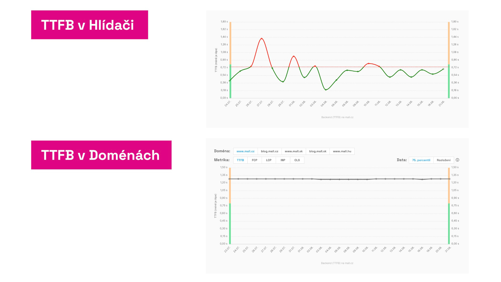 Same metrics, different results. Why?
The Watchdog has the advantage of quickly detecting deteriorations or improvements in metrics. However, the real status needs to be verified on the “Domains” report, which displays CrUX data from users. These are shown only cumulatively over the past 28 days, which is not useful for daily alerts sent from the Watchdog.
Therefore, we need both the quick Watchdog and the precise Domains report.
Specific Graphs in the “Domains” Report and How to Use Them
Let’s now look at the individual graphs, their content, and significance:
User Measurements for Domains
The first graph displays the current metric state for specific device types (mobile or desktop) and any movement of metrics for better or worse:
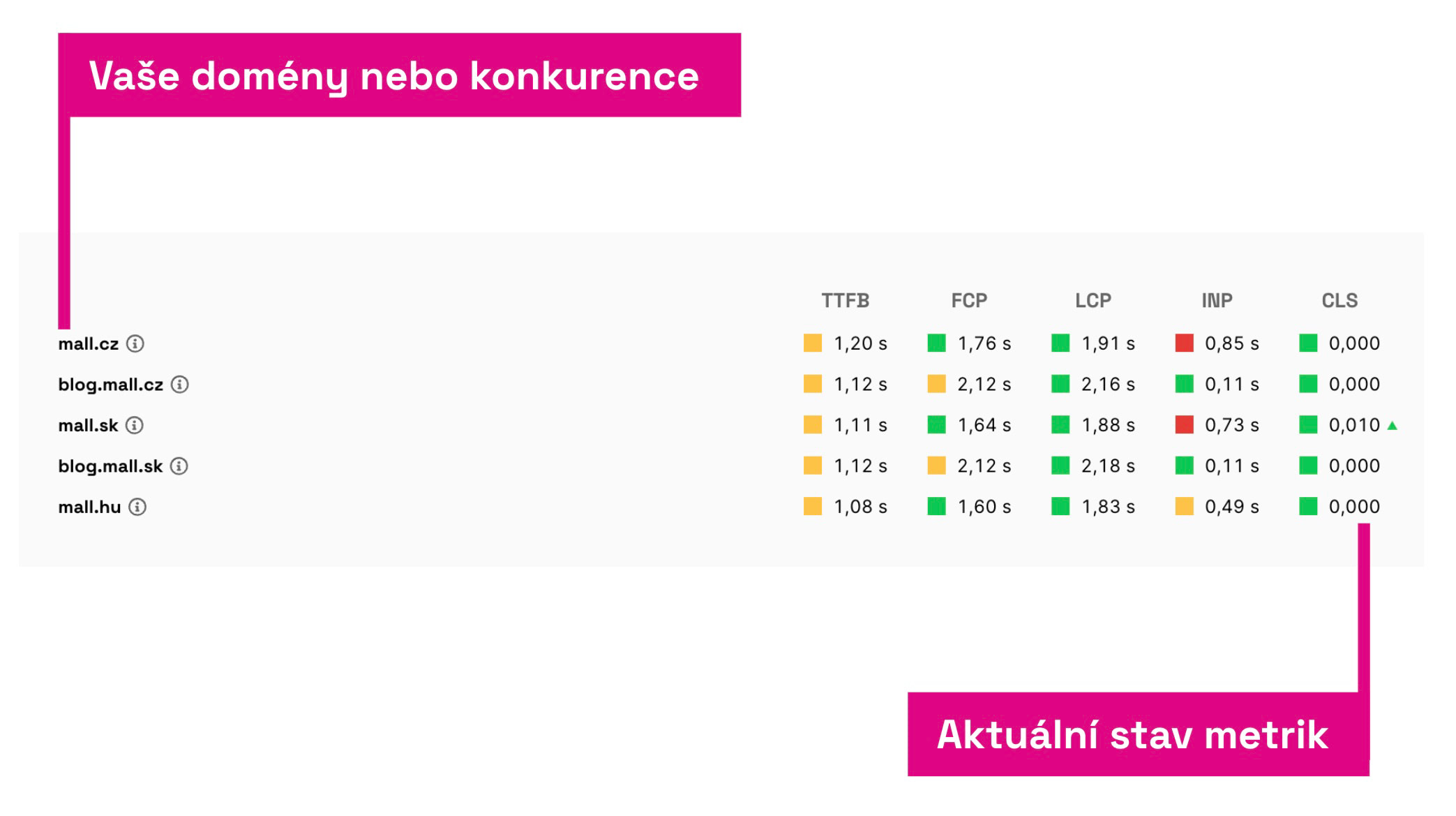 Here you see data from Google users, from the Chrome UX Report.
Included are both Core Web Vitals metrics (LCP, INP, CLS) and auxiliary metrics – TTFB and FCP.
In the table, you can see how you fare with metrics compared to the competition or your other domains.
Red or green triangles next to numbers indicate significant changes compared to the state a month ago. Such marked metrics deserve more attention.
User Metric Trends Over Time
The next graph shows the trends of metrics over time:
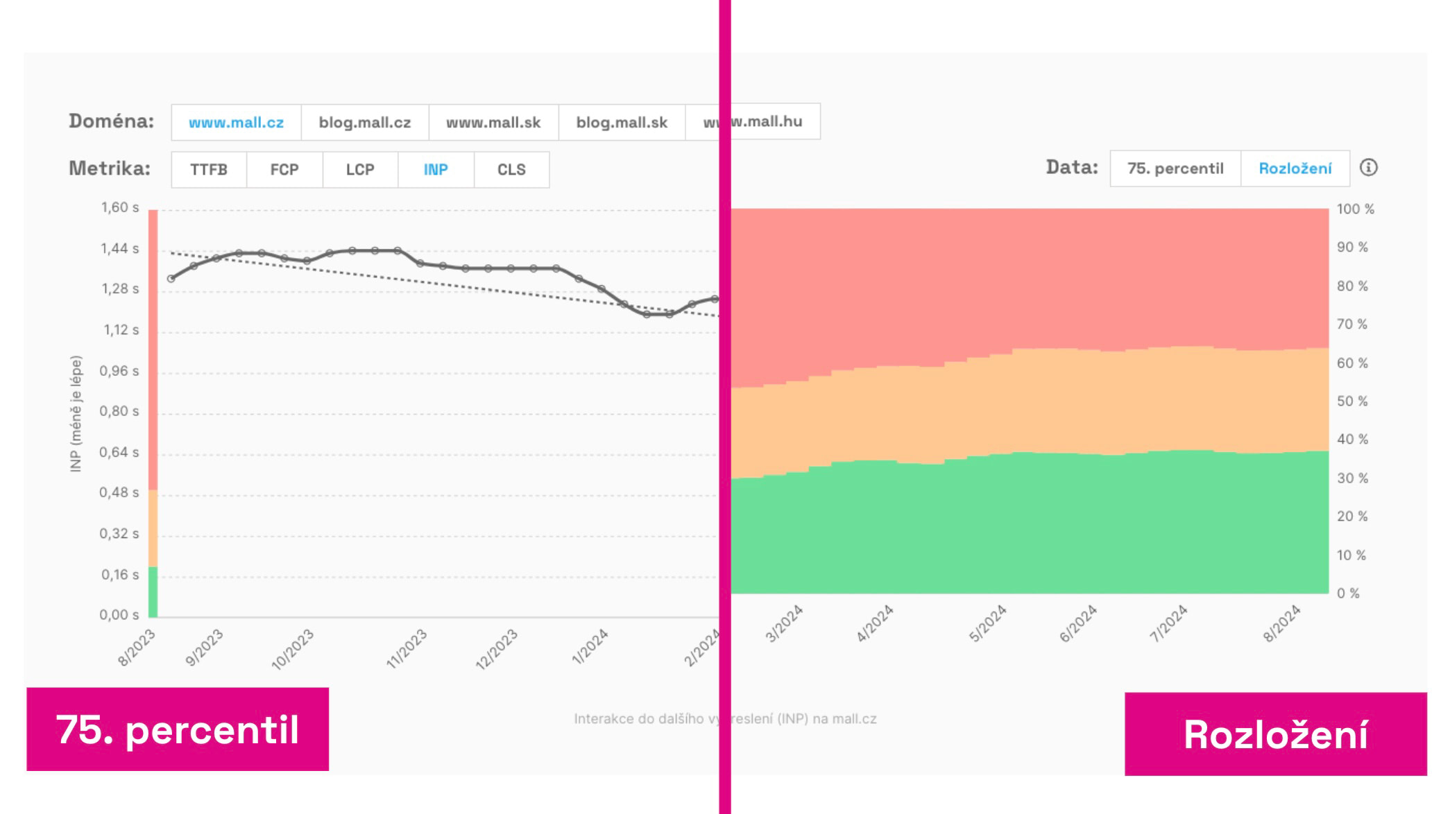 Two different views of user data: metric value trends (75th percentile) and distribution of three types of values.
As with other speed monitoring graphs, you can choose how to display the data:
- 75th Percentile – Google uses this value for evaluating the entire domain in Core Web Vitals metrics. On the sides of the graph, you can see if the value is within recommended limits (green), requiring improvement (orange), or poor (red).
- Distribution – You will see the percentage share of different metric values for all users. Here too, you see which portion of users meets the metric (green), needs improvement (orange), or records it as poor (red).
Note that in both cases, these are cumulative data for the last 28 days. What does “cumulative” mean? The value for the current day does not show today’s state but the 75th percentile from values collected over 28 days.
Larger changes in metrics simply won’t be visible immediately but will gradually appear in the graph over almost a month. Even a small change can indicate a more significant shift in the metric value.
The 75th percentile value may seem stable, but if the distribution changes, it is likely that it will eventually affect the metric value.
How to use this graph? At PageSpeed.ONE, this is the graph we monitor the most. If optimizations are deployed, it can indicate positive changes within a few days. We primarily monitor the Metric value, but if it is stable, we also look at the distribution trend.
Domain Speed by Month
Another set of graphs again displays metric values, but not by days, rather by months:
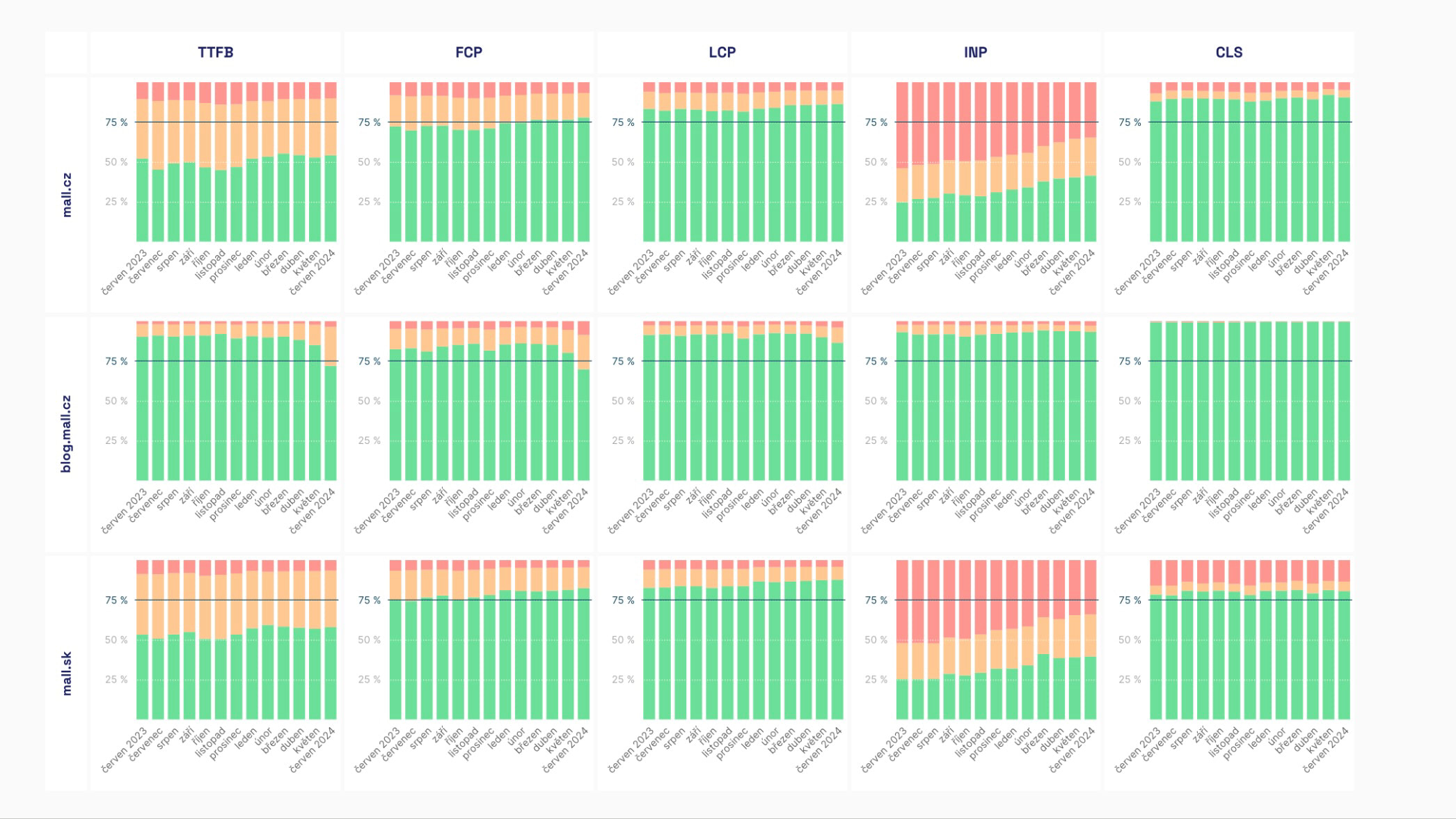 The domain speed graph by month is vibrant. The more green, the more speed.
In these graphs, you can decide whether to see the metric value (75th percentile) or simply the distribution of green, orange, and red values.
You will see the following:
- Trends in Core Web Vitals metrics (LCP, CLS, INP) and others (FCP, TTFB).
- Trends in navigation types (see also graph below).
The data here show a long-term view and come from CrUX database values in BigQuery, where the numbers are stored cleanly.
We take this graph as a managerial view over a longer period, indicating whether your speed optimizations are successful or not.
Graphs Available in monitoring PLUS
All data come from the Chrome UX Report (CrUX), so they are data from Google users.
🔐 These reports are available exclusively for users of monitoring PLUS.
Device Types (Form Factor)
The “Device Types” graph shows from which devices your users access the web. Data are divided by User-Agent into three categories: mobile, tablet, and desktop.
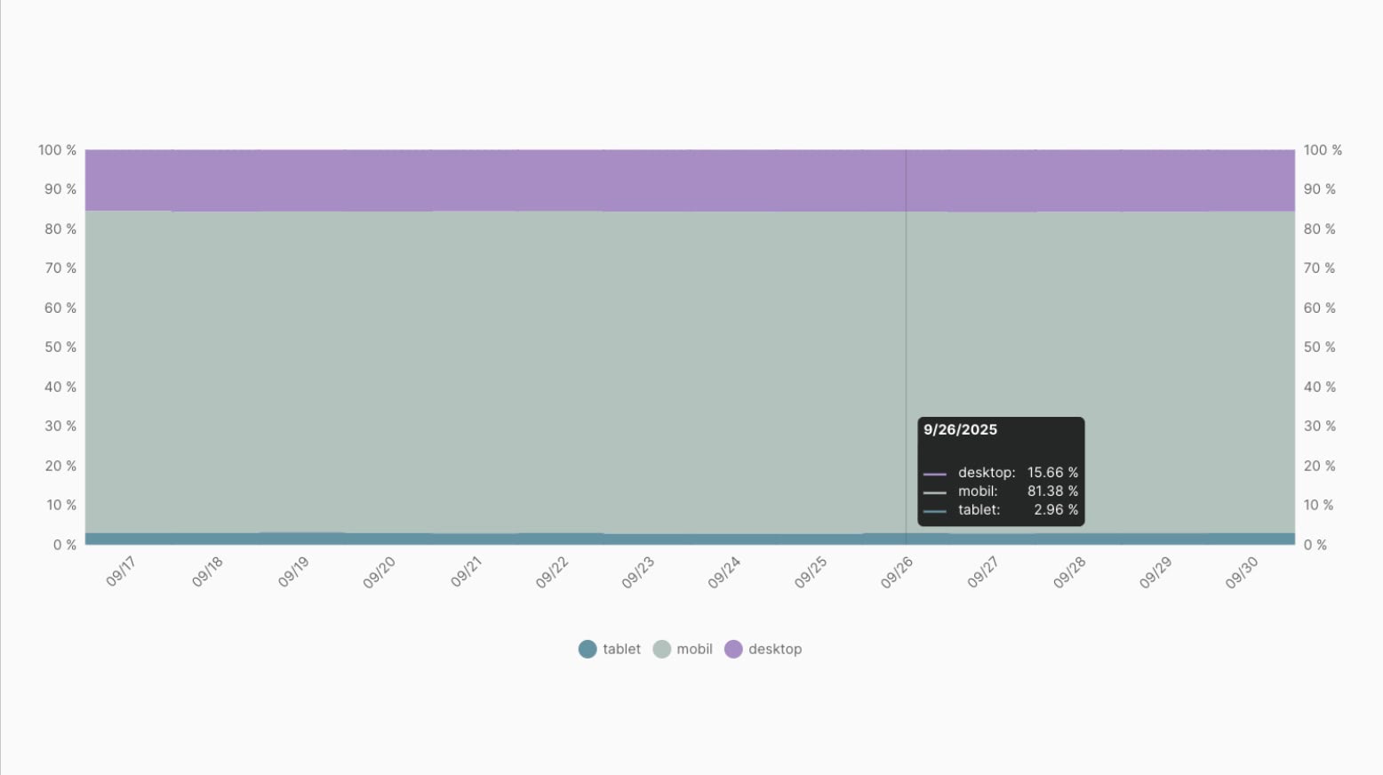 Do you need to optimize more for mobile or desktop? And what about tablets?
How to Read the Graph?
- The X-axis displays the timeline in individual days.
- The Y-axis shows the percentage representation of each device.
- Each color represents one device: mobile, tablet, or desktop.
- Hovering over a specific date shows the exact share of visits from that device.
How Does the Device Distribution Graph Help You?
- You can easily determine which device type is most important for your users.
- If most visitors come from mobile, it makes sense to focus optimizations there.
- Small shares of devices (such as tablets) often don’t need priority attention unless they have significant speed issues.
- Watch if the device ratio changes over time. For example, a growing share of mobiles means higher demands on the speed and simplicity of the mobile version of the website.
Round Trip Time (RTT)
The Round Trip Time graph shows how “far” or “close” your users are from a network perspective. The Round Trip Time (RTT) metric expresses the time a request takes to travel back and forth between the user and the server.
How to Read the Graph
- The Y-axis shows the RTT value in milliseconds.
- The X-axis represents the timeline in individual days.
- Two display methods are available:
- 75th Percentile – the value surpassed by only a quarter of the worst connections.
- Distribution – the percentage share of different RTT values among users.
RTT values within the distribution are divided into three categories:
| Network Latency | From | To |
|---|---|---|
| Low | 0 ms | < 75 ms |
| Medium | 75 ms | < 275 ms |
| High | ≥ 275 ms | ∞ |
How Does the RTT Graph Help You?
- If RTT is consistently high (well above 150 ms), consider using a CDN like Cloudflare or bringing content closer to users.
- Stable low RTT values mean the website’s speed isn’t limited by the network.
- A sudden increase in RTT might indicate network or infrastructure issues.
The Navigation Types Distribution graph shows how users reached your domain’s pages. Data distinguish several navigation types, such as regular loading, cache loading, or instant loading using back/forward cache.
Navigation types show the technical means users employ to access specific pages of the domain.
Let's illustrate this graph with an example:
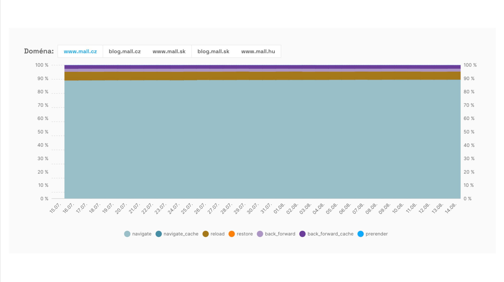 Development of the share of different navigation types when accessing pages on the domain www.mall.cz.
- The X-axis displays the timeline in individual days.
- The Y-axis shows the percentage share of different loading types.
- Each color represents one loading type, for example:
- navigate – regular page loading
- reload – page reloading
- back_forward – back or forward navigation in browser history
- back_forward_cache – instant loading from back/forward cache
- prerender – preloading using Speculation Rules API
- navigate_cache – loading from HTTP cache
- See how often pages load from cache or bfcache, resulting in an almost instant user experience.
- If you have a high share of regular loads (navigate), look for opportunities to better utilize cache or prerender.
- An increase in reloads might indicate user dissatisfaction leading to page reloads.
- The ideal state is when as many navigations as possible occur instantly (bfcache, navigate_cache, prerender).
LCP Resource Type
The LCP Resource Type graph shows whether the element determining the Largest Contentful Paint (LCP) value (LCP element) comes from an image or a text element (like a heading or a text block).
How to Read the Graph?
- The X-axis displays the timeline in individual days.
- The Y-axis shows the percentage share of each resource type.
- Each color represents a different element type – image or text.
- Hovering over a specific date shows the exact ratio of both resources.
How Does LCP Resource Help in Tuning This Metric?
- If most LCP elements come from images, focus on their optimization – formats (WebP, AVIF), compression, and loading.
- If text elements prevail, it makes sense to focus on web fonts and text rendering.
- This graph quickly shows where to concentrate efforts to improve LCP.
We also have tips on LCP optimization in the help section.
LCP Image Subparts
The LCP Image Subparts graph breaks down the loading time of an image into several parts. This allows you to see which phase of image loading most affects the final Largest Contentful Paint (LCP) metric value.
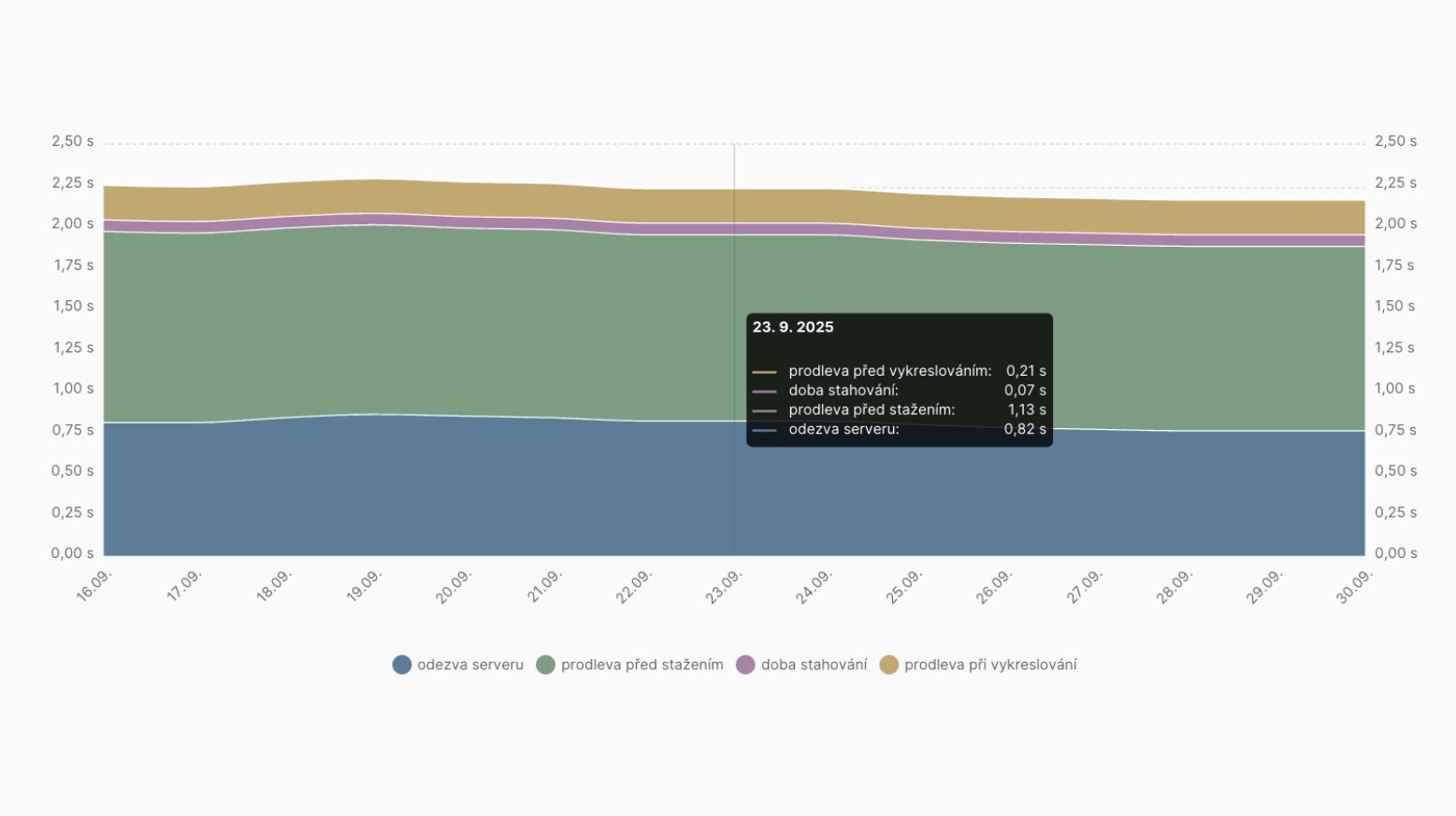 What’s causing the delay in loading LCP images here?
How to Read the Graph
- The graph consists of several colored parts corresponding to different phases:
- Server Response – time before the server starts sending the image.
- Download Delay – waiting before the image download actually starts.
- Download Time – how long the data transfer takes.
- Render Delay – time between downloading and displaying the image in the browser.
- The height of each part shows how much time it takes.
- Hovering over a specific date shows precise values in milliseconds.
How Does This Help You
- If download time dominates, image optimization (compression, modern formats, CDN) will help.
- If server response is high, the solution is backend acceleration or deploying a CDN.
- If render delay is significant, there might be an issue with JavaScript or how images are inserted into the page.
- This graph allows you to focus precisely on the loading part that most hinders LCP.
Summary
Let’s summarize the information about the “Domains” report:
- This report is one of the most important in our monitoring. It allows tracking speed metric values from the Chrome UX Report for all measured domains.
- Beyond the immediate state, you see daily trends, which is excellent for monitoring the impact of specific changes on the website, as well as monthly trends, giving you feedback on whether your speed optimizations are progressing successfully.
- The Navigation Types report shows your room for leveraging instant navigation types.
Detailed information on the performance of specific URLs is provided by the “Pages” report, and the “Watchdog” report offers feedback on the daily development of metrics for your URLs.
Speed Monitoring PLUS
Try our monitoring app free for a month.
5,400 CZK annually per website. Invoice only, no credit card needed.