Tester 4.0: New “Summary” Version, New Metrics, New Charts (and Much More)
We are thrilled to introduce you to version 4.0 of our speed tester, on which we have been working for the past few months.
We've prepared so many updates that they wouldn't fit into one article, so we're kicking off a series where we'll gradually unveil and explain everything.
New Version of Summary
The initial test page, the so-called “Summary,” was visually appealing, yet as the tester's features evolved, it fell short of serving as the main summary of all web speed information.
The new version of the “Summary” report brings a host of new features, so let's dive in.
Displaying Important Data in a Tabular Format
For each tested domain and URL, we display available speed data in a concise table, which many of our users have come to appreciate:
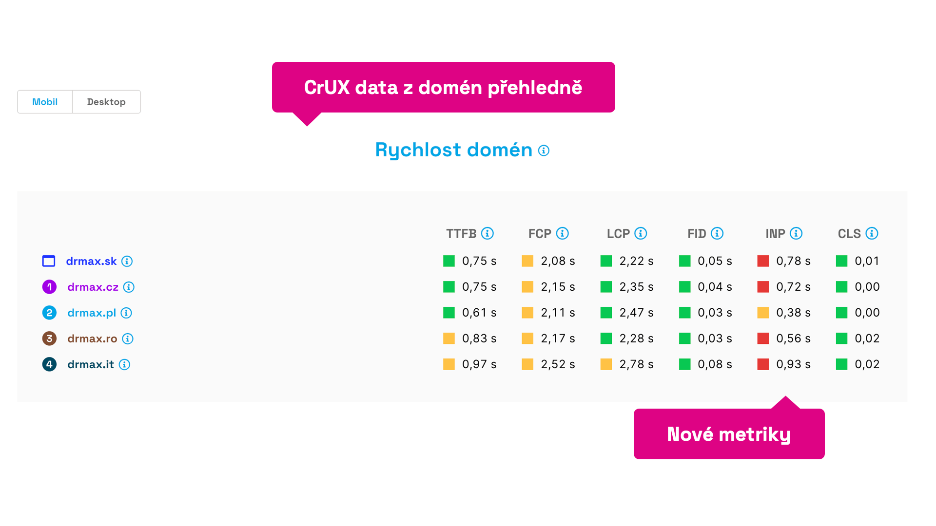 Data of all significant metrics for Dr. Max’s domains in a clear format.
As you can see in the image, we now display more metrics—all those that are part of Web Vitals or auxiliary metrics provided by Google in the Chrome UX Report.
We’ve freshly added metrics like INP, FCP, and TTFB, and we've organized indicators according to their occurrence during page loading.
This will be useful for you to immediately compare the speed of your websites or make comparisons with competitors.
In the image above, we immediately see, for example, deficiencies in the new INP metric and can question why the Polish domain has such low values compared to others.
Metric Changes Clearly in the “Summary”
Our users have enjoyed the dashboard arrows, which show metric development compared to the previous month.
This feature is now also available directly in the Summary report:
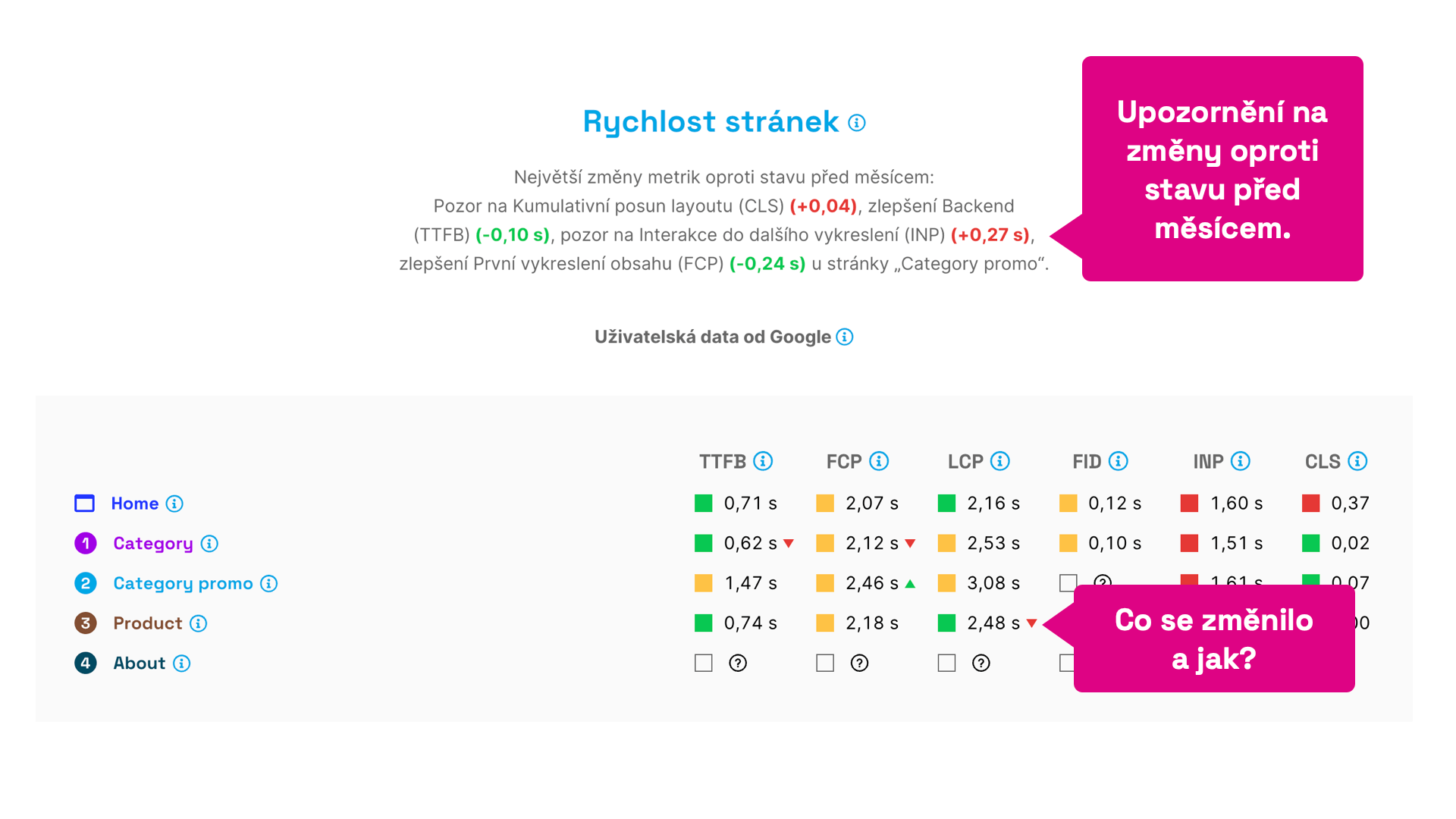 Immediately see what is getting worse and what is getting better.
If you regularly monitor your site's speed, this display will quickly show you the current state and what is changing, as well as what to watch out for.
You’ll get a detailed view of the data in specific reports, such as “Pages”, “Domains”, and others.
New Charts
The first thing you might notice in the new version is the revamped chart appearance:
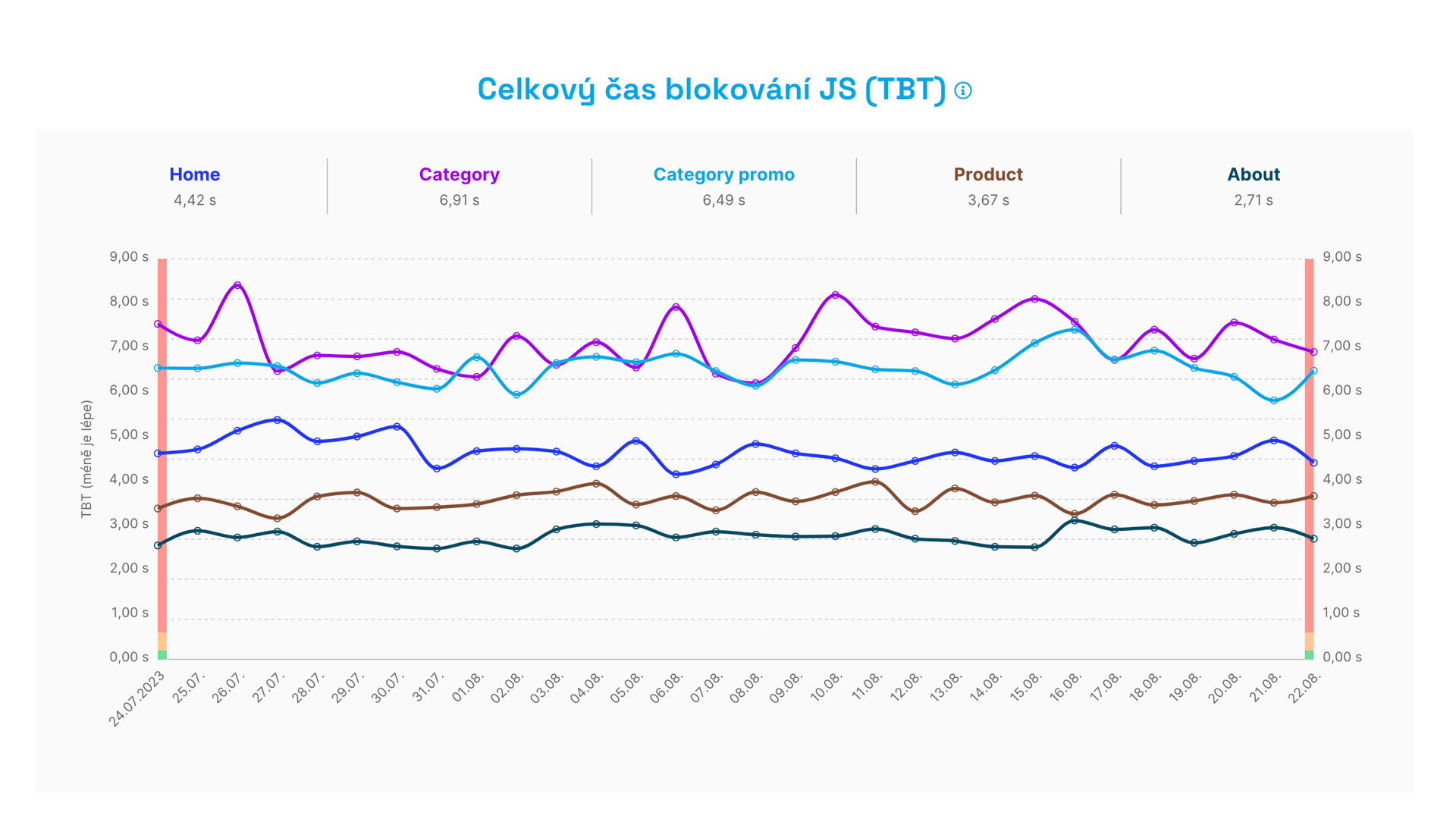 New charts.
What has changed?
- We've added multifunctional navigation above the charts, which serves as a legend and helps you orient yourself.
- We’re using a new chart library in the background, which better meets our goals.
- The chart lines are rounder, more pleasing to the eye.
Let's take a closer look at the mentioned multifunctional navigation. It’s full of surprises.
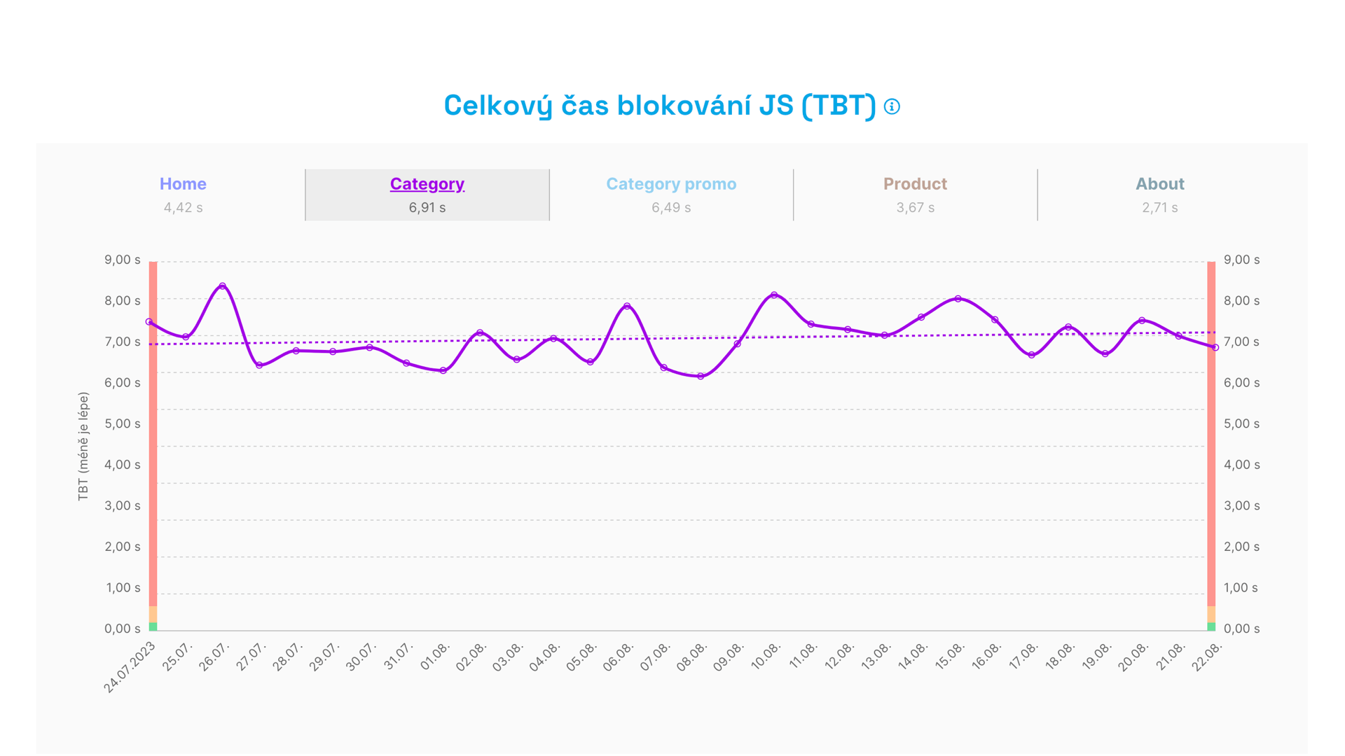
Hovering over a specific item highlights the graph line belonging to that page:
 Highlighting a specific line in the graph. Something is slightly deteriorating here, and it's TBT.
Highlighting also shows you the trend line, as it often happens that the graph itself doesn’t easily reveal a trend of improvement or deterioration to the human eye.
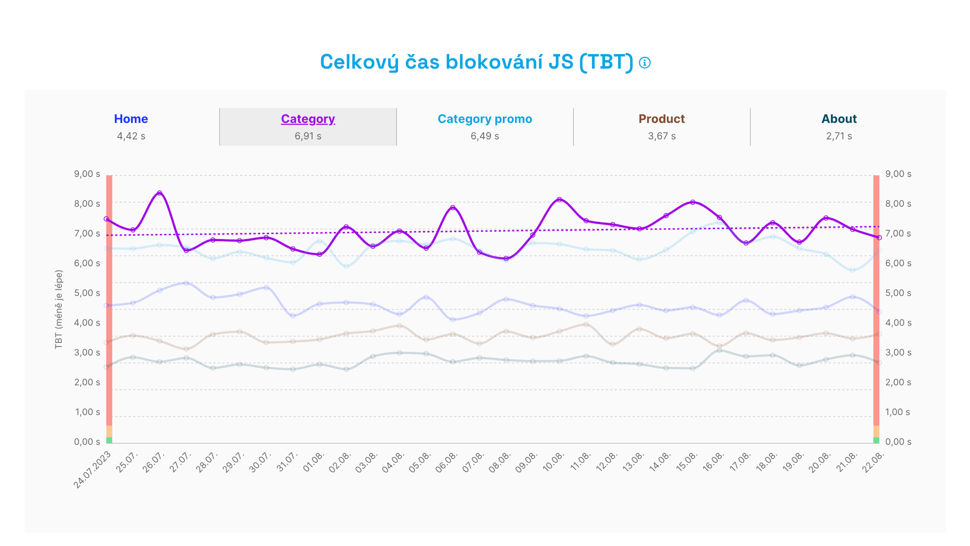
Another change occurs upon clicking:
 Click to see only one line, here for the Category type page.
This display filters out just one page (or domain) in the graph, allowing you to better focus on its development.
Another novelty appears when you click on a point in the graph. You get a list of all tests and metric values from which the test was computed. It might look like this:
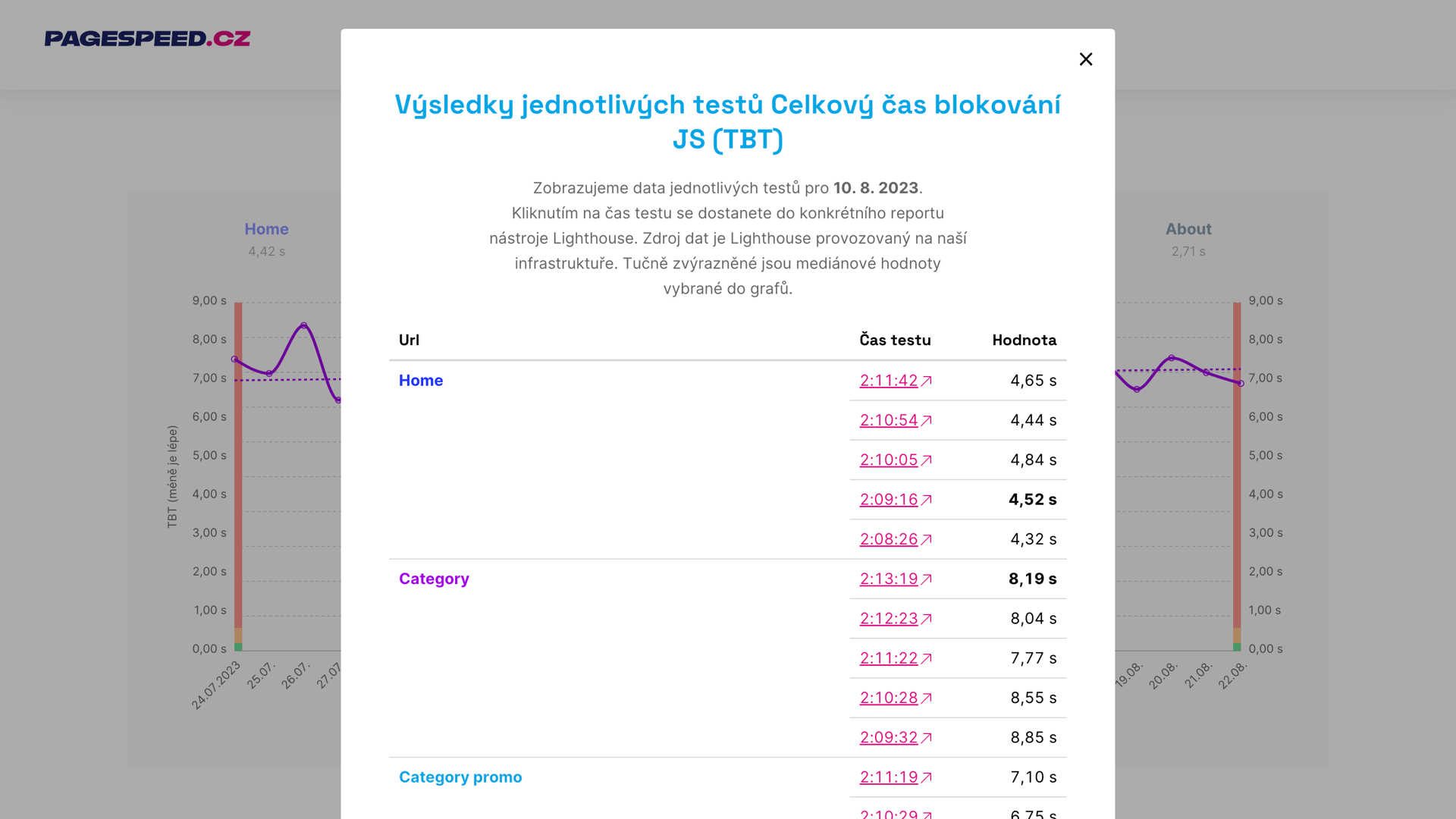 Layer with performed tests and metric values.
Clicking on the test time will take you to the test run result.
The new charts are a subtle yet crucial change for the fourth version of the speed tester.
Take a look at the video where you can see all the new features in one place:
Other News in Version 4
We've been working on the fourth version of the tester for several months, so it's clear that we've added a plethora of new features. Let's list some of them briefly:
Speeding Up the User Interface
We store and display large amounts of data about more than 24,000 domains and 44,000 URLs in databases.
During the development of version 4, we frequently resorted to various optimizations to make the user interface display faster. The interface of most tests is now significantly faster in version 4 than in the previous version.
Changes in the User Interface
Some of these changes you will surely notice:
- We’ve streamlined and simplified the main test navigation, as well as the user sections.
- Each report state now has its own URL, so you can easily send it to someone else.
- We’ve simplified navigation elements to make more content visible.
- Each metric chart has its own anchor, allowing you to go directly to it.
There are plenty of new features, but that's not all. Stay tuned for what we will present in the coming weeks.
Of course, we've thoroughly tested the fourth version of the speed tester, but a glitch might slip through. Send us an email at info@pagespeed.cz or chat with us directly in the app if you encounter anything.
We wish you speedy websites!