Tester Version 2: User Data from the Chrome UX Report and Other Enhancements
 Martin Michálek5/11/20217 minutes reading
Last year, when we at PageSpeed.ONE embarked on developing the tester, we had two objectives in mind: to create a tool that seamlessly integrates into our web speed measurement workflows and to raise awareness about the importance of speed itself.
With the release of this second version, we've taken another step towards fulfilling these goals. Our tester now more easily reveals the status and development of Core Web Vitals metrics for your domain, enabling you to better meet the forthcoming Page Experience update from Google.
There are many new features in the tool, but let's highlight the most important ones:
- How is user speed evolving? Data from the Chrome UX Report
- Web status summary and metric changes
- Graph periods and metric-based toggling
You'll notice these changes in your older tests, or you can create a new one at pagespeed.one. Now, let's delve into these promised updates.
How is User Speed Evolving? Data from the Chrome UX Report
As you may know, Google is preparing to place greater emphasis on speed and user experience as part of its Page Experience update.
Google assesses all pages of a domain or a specific page using user data from Chrome, which is publicly available as the Chrome UX Report (CrUX).
There are several ways you can access this data: querying Google's databases, creating a dashboard for Data Studio... however, none are quite as convenient as we'd like or account for local specifics.
With the tester on PageSpeed.ONE, you can now obtain this data simply by entering your website's address into the test.
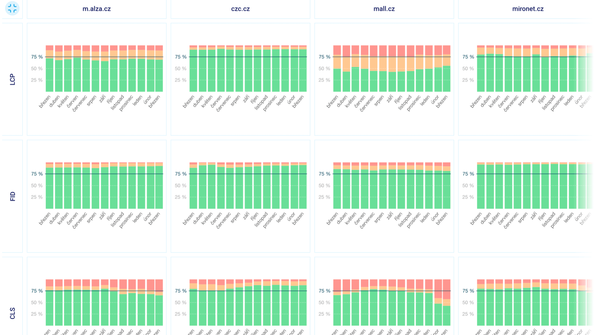
In the “Domains” report, you'll see the monthly data trends for all domains entered in the test and the Web Vitals metrics (LCP, INP, CLS).
You can switch the data by device type (Mobile, Tablet, Desktop) or by display type – you can view either distribution or the 75th percentile:
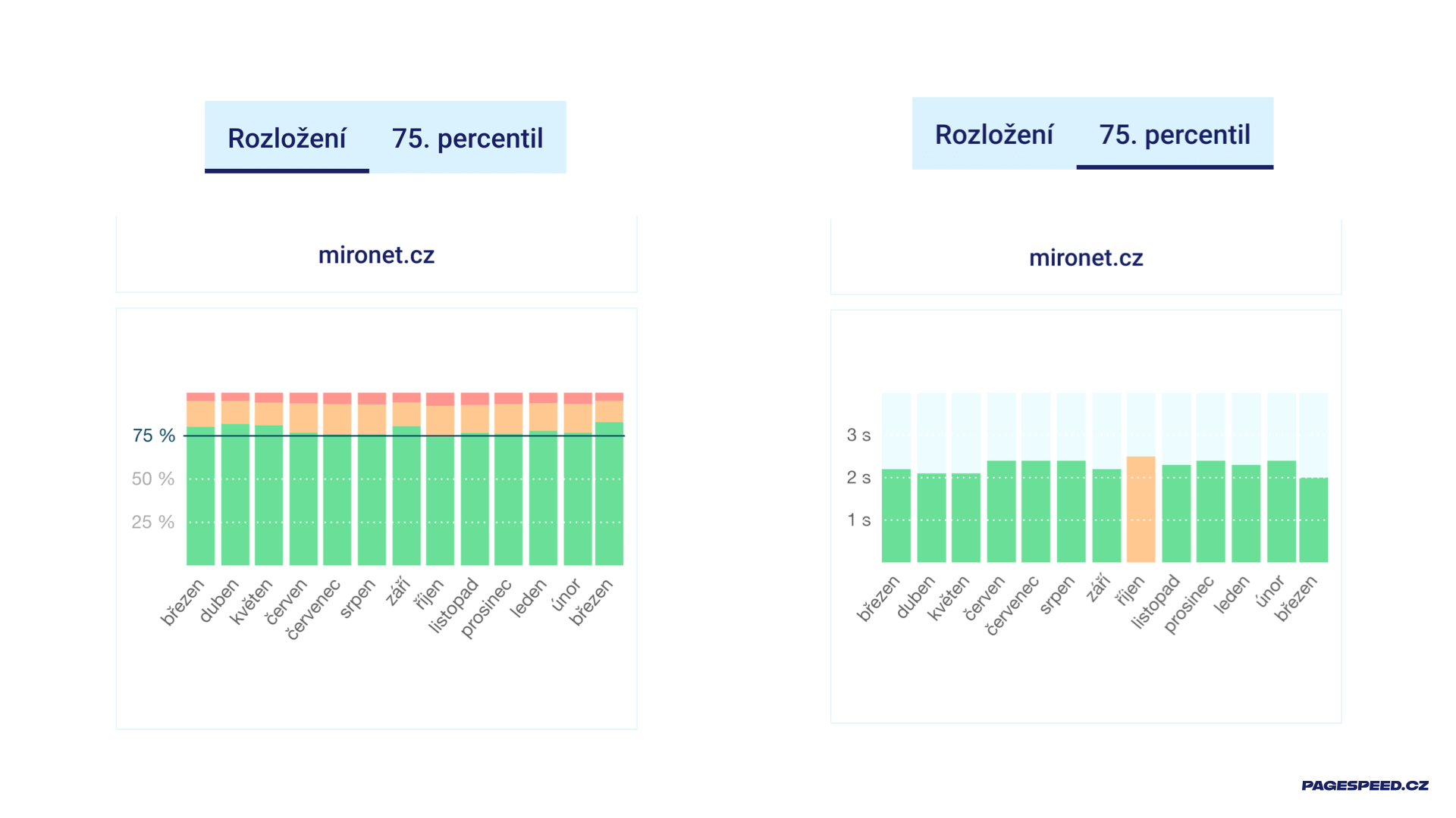
Let's explore the differences between these display types:
- The "Distribution" graph shows what portion of your users meets the metric (green), which requires improvement (orange), and which part Google considers to provide a slow user experience.
- The "75th percentile" graph is even more intriguing – it shows you the value at the 75th percentile, the value on the dark line in the "Distribution" graph. This is also the number Google cares about. For instance, the image shows that the LCP value on the mironet.cz domain in March 2021 (on the right) is 2.0 seconds. The maximum for meeting the metric is 2.5 seconds, according to Google, so all is well, indicated by the green color.
Note: In the "Domains" report, we download data from the Chrome UX Report for Czech and Slovak web users, so if you operate a service for international visitors, you might not see data there.
Why is Domain Comparison Useful?
If you're addressing speed, you need to consider it over the long term and know how you stand with real users, how your competition fares, and how Google evaluates your website. You can discern all this from our "Domains" overview.
We show these graphs to our clients during long-term work on speed optimization, and they are crucial for evaluating whether the efforts are successful.
Let's see what can be gleaned from this graph for one of our client sites:
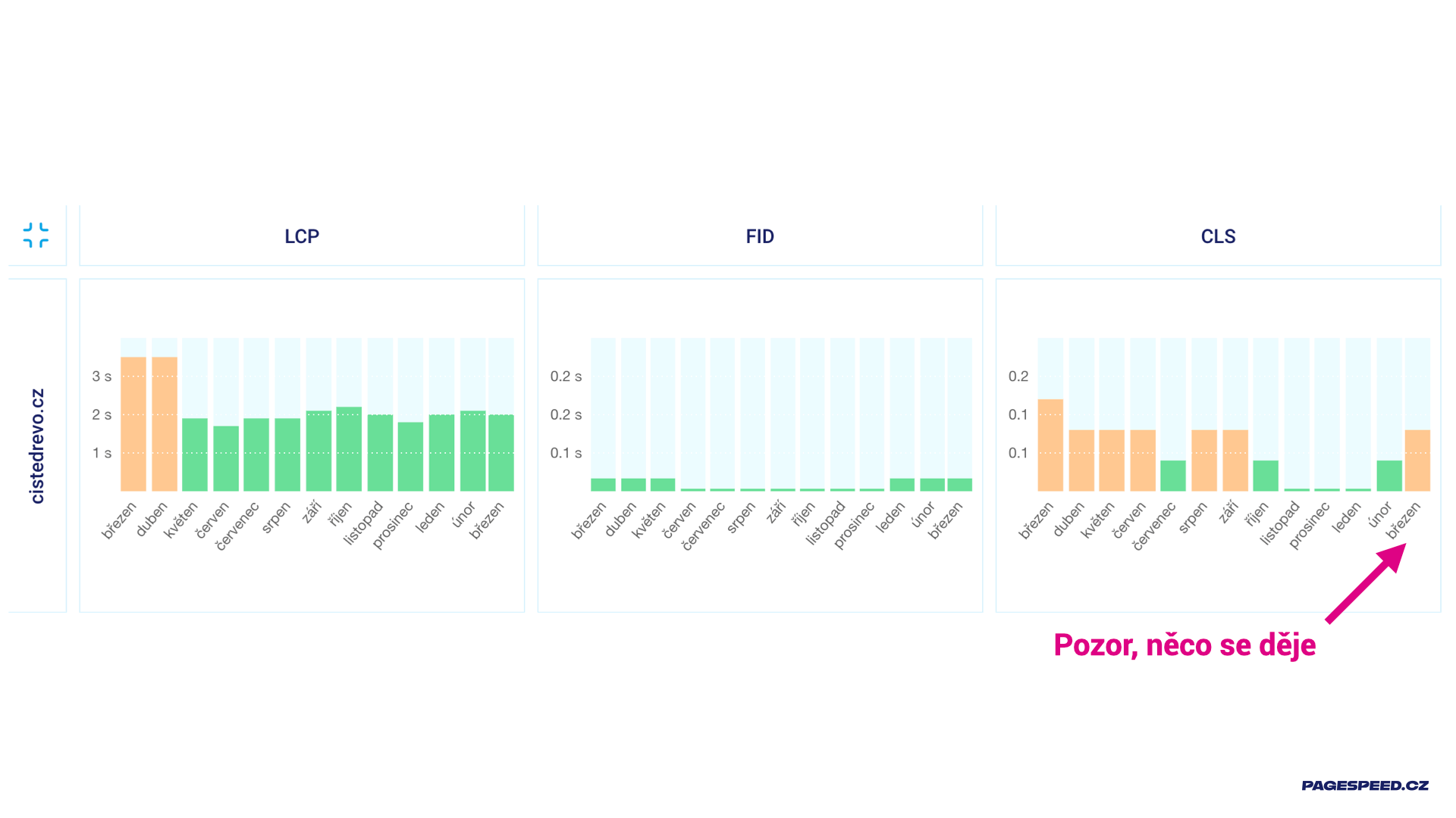
The green bars in the March 2021 numbers (on the right) for the LCP and FID metrics tell us that for the entire domain, we meet two out of the three Web Vitals metrics. Additionally, the graph shows us that the status of the metrics is fairly stable. That's the better part of the news.
The worse part is the "erratic" CLS metric, which in March 2021 spiked beyond the recommended maximum of 0.1 for the entire domain. So something is happening, and we should investigate. Just a note, this is user data. It doesn't necessarily mean something on the website changed for the worse; it could just as well mean something changed for the users or even in the metric's calculation.
In this case, we're somewhat fortunate, though I'm not sure if that's the right term – all three factors play a role here. Besides website adjustments, users also updated to a new version of Chrome, which calculates Cumulative Layout Shift slightly differently.
So I see the status and the trend. That's exactly what I need for long-term project work.
You may have noticed that we also download data for backend speed (TTFB), a metric not part of Core Web Vitals. This is to help you easily evaluate whether slow LCP is more of a frontend or backend problem.
We believe the new data in the reports will also assist you.
"Summary" Tab and Metric Changes
In the new "Summary" tab, we display the speed status of the main measured page for the day in question. We've also added information on metric changes over short and long periods.
Previously, you could see the speed status of the measured page here. If we have user data from the Chrome UX Report, we display four "gauges"; otherwise, only one from the Lighthouse tool:
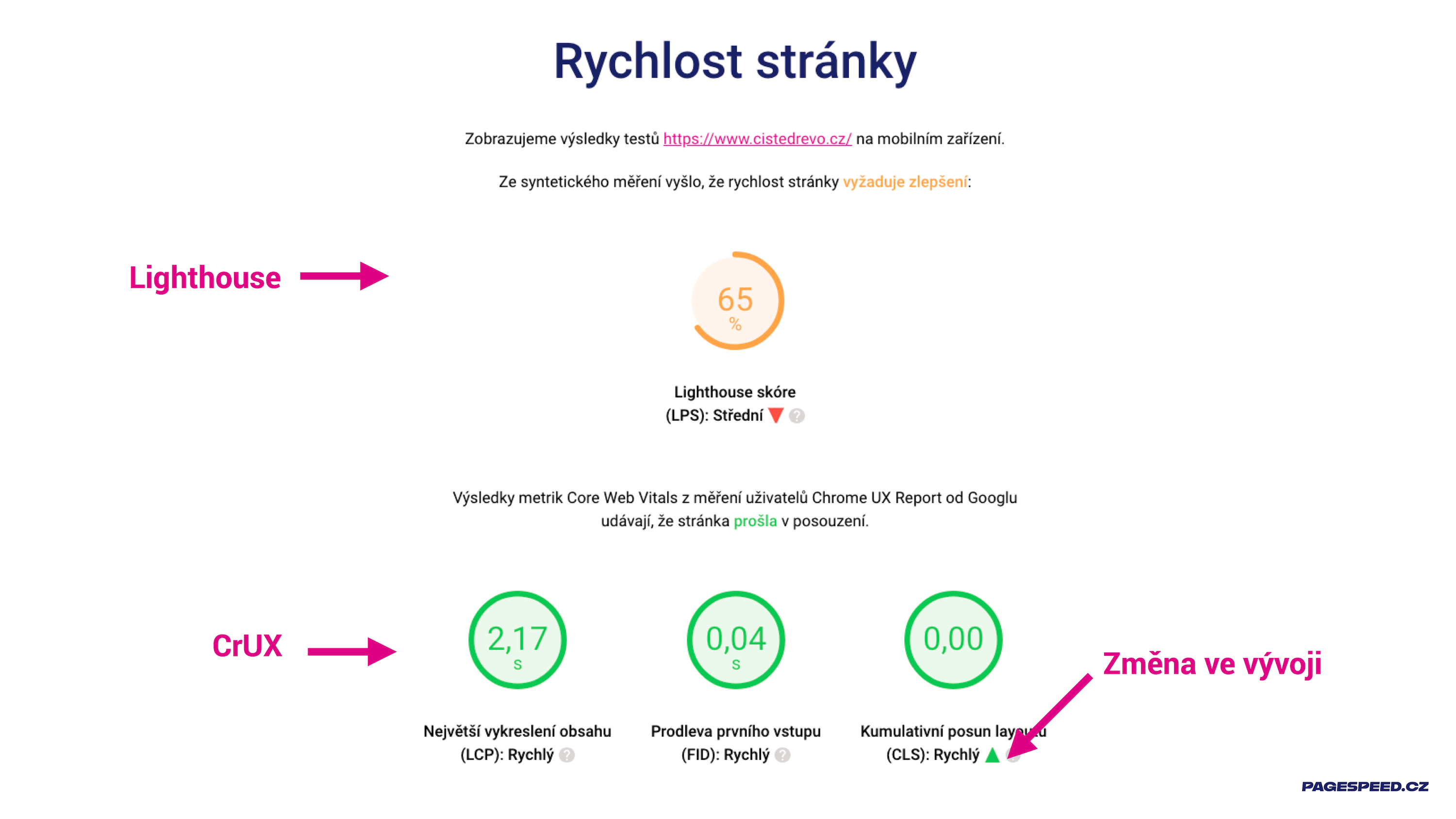
Notice that we now indicate metric trends over time. Changes in metric values greater than 15% compared to the previous week are reported here.
Domain speed is new in this section. If there is enough user data in the Chrome UX Report, you'll see three "gauges" for Core Web Vitals and again the trend over time. This time we compare the current status to a month ago, as we consider long-term trends more appropriate here:
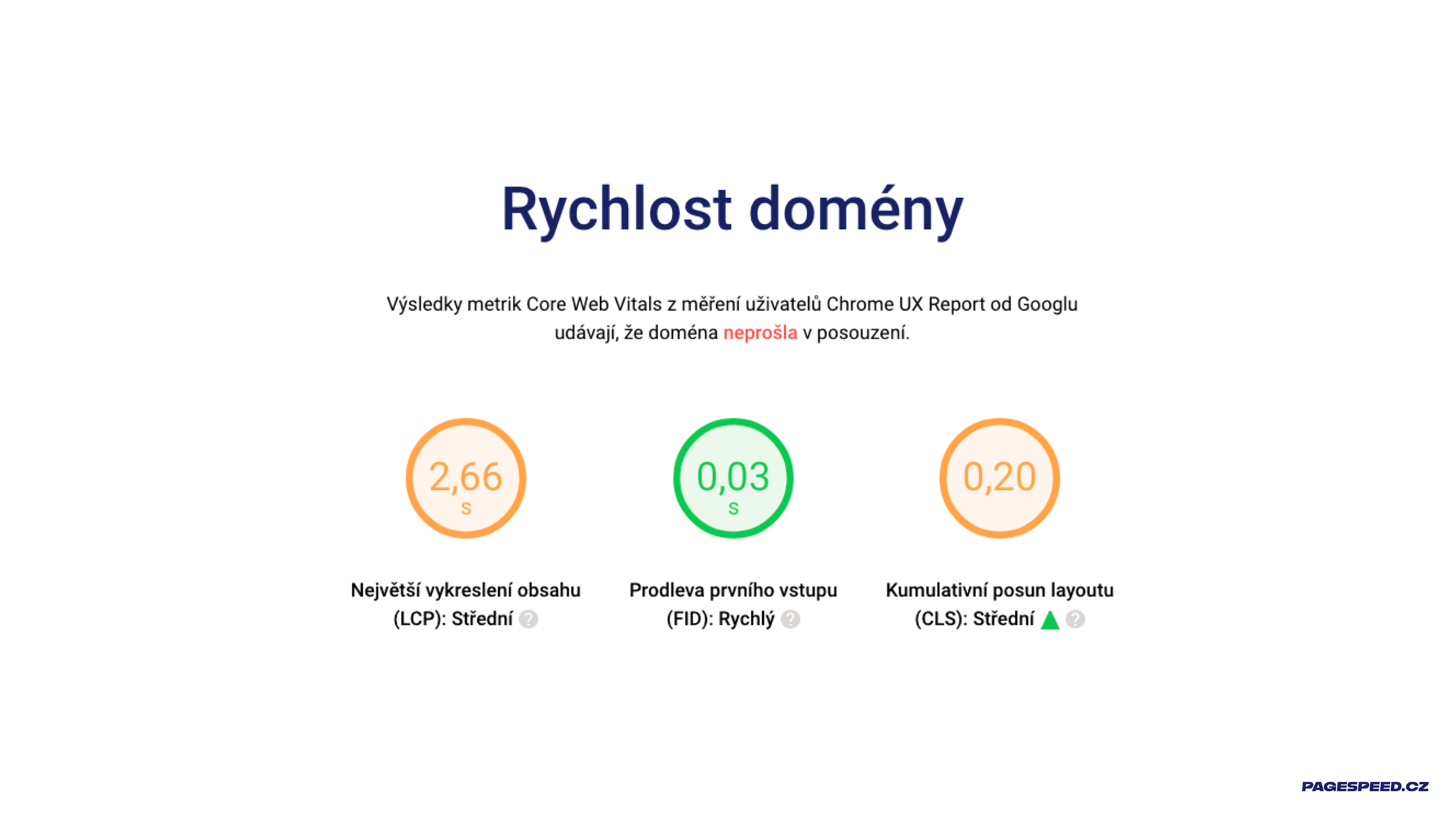
The data in the "Summary" tab comes from the PageSpeed Insights API, and the user figures from CrUX here represent a cumulative average over the last 28 days. Therefore, the data in the "Summary" tab, like in the "Measurement" tab, may differ from the data in the "Domains" tab, where it's by month.
More about the “Summary” report is available in the documentation.
Graph Periods and Metric-Based Switching
This change is one you've often requested. Historically, we didn't use any filters in the graphs because they weren't needed at first. However, for some domains, we've been tracking speed metrics daily for nearly a year, and often we'd like to see the trend over the last month or three months:
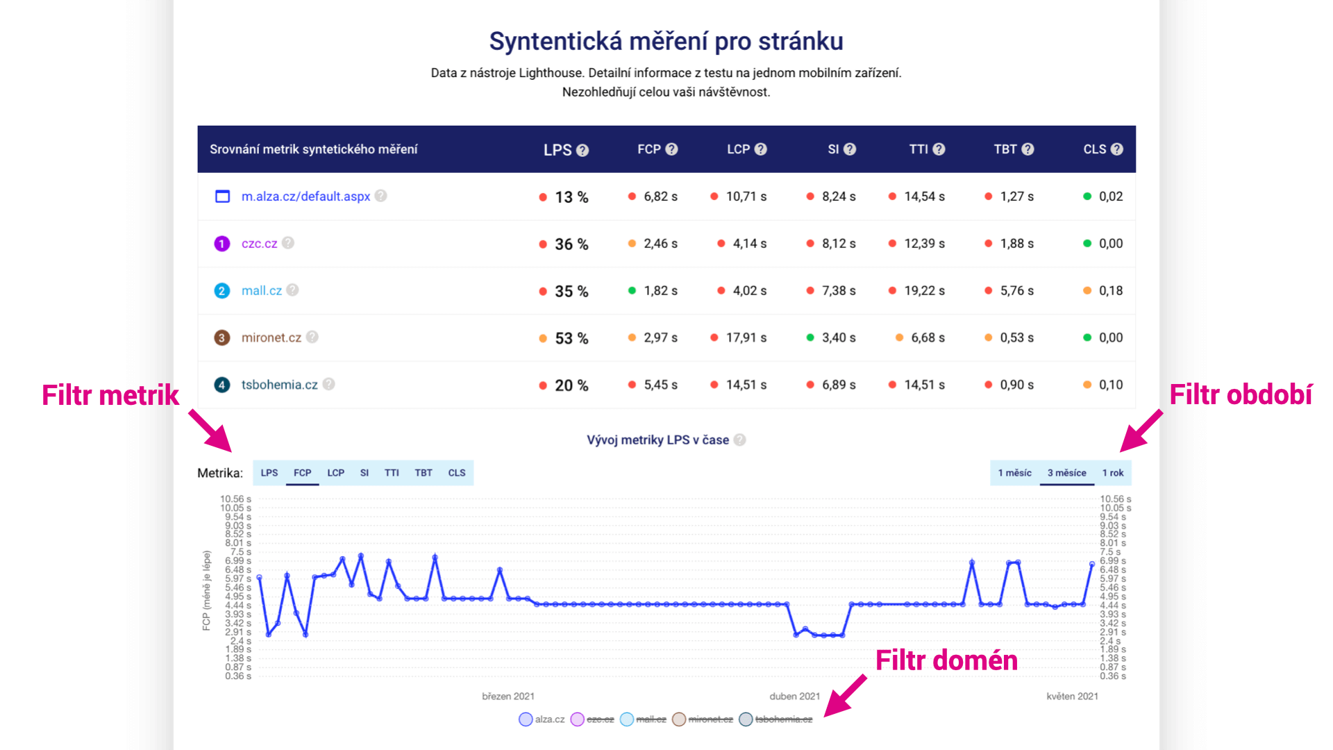
It is now also possible to switch the Metrics displayed in some graphs. Who wouldn't be interested in the LCP trend measured by Lighthouse?
First tip: Did you notice that you can turn off the display of measured URLs in the graphs to get a nice clean graph for just one of them?
Second tip: Click on a dot in the graph, and you'll get a complete Lighthouse report for that URL and that test.
Minor Adjustments
In version 2, we've also implemented several other changes, here is a list of the most important ones:
- We've adjusted the appearance of the "gauges" in the test summary to better reflect the metric's status.
- We've divided the test content into tabs, added explanations of what you can find in them, and made several other adjustments for a more user-friendly interface.
- We've fixed functionality when using the Back button in the browser.
- We now provide more explanations for potential errors returned by PageSpeed Insights.
How to Use the New Features in the PageSpeed.ONE Tester?
For our clients, we always create two tests:
- A test for the client's domain and their competitors. Here, in the "Domains" tab, you'll see how the client's domain performs in terms of speed and how the market in which they're striving to succeed is doing.
- A test for the website's landing pages. Besides the homepage, we include, for example, detail pages or article categories for content sites. The Web Vitals report from Google Search Console helps in selecting suitable URLs.
If a client uses multiple domains or subdomains, we create another test just for these domains. CrUX data may differ for domains example.cz and subdomain.example.cz.
Do you like the new features in the tester? Or is there something missing? Write to us at info@pagespeed.cz. We welcome any feedback or ideas.